%2520(1).png%3Falt%3Dmedia%26token%3D6fb48f09-a8eb-423f-8296-83ba614ae5a4)
%2520(1).png%3Falt%3Dmedia%26token%3D6fb48f09-a8eb-423f-8296-83ba614ae5a4)
Body Color
Aasaan offers exciting array of options to personalize your website's body color, including background, text, heading, link, button, and icon/arrow colors. This empowers you to create a website that perfectly aligns and enhances user experience by emphasizing readability, visual appeal, and cohesive design.
STEP 1:
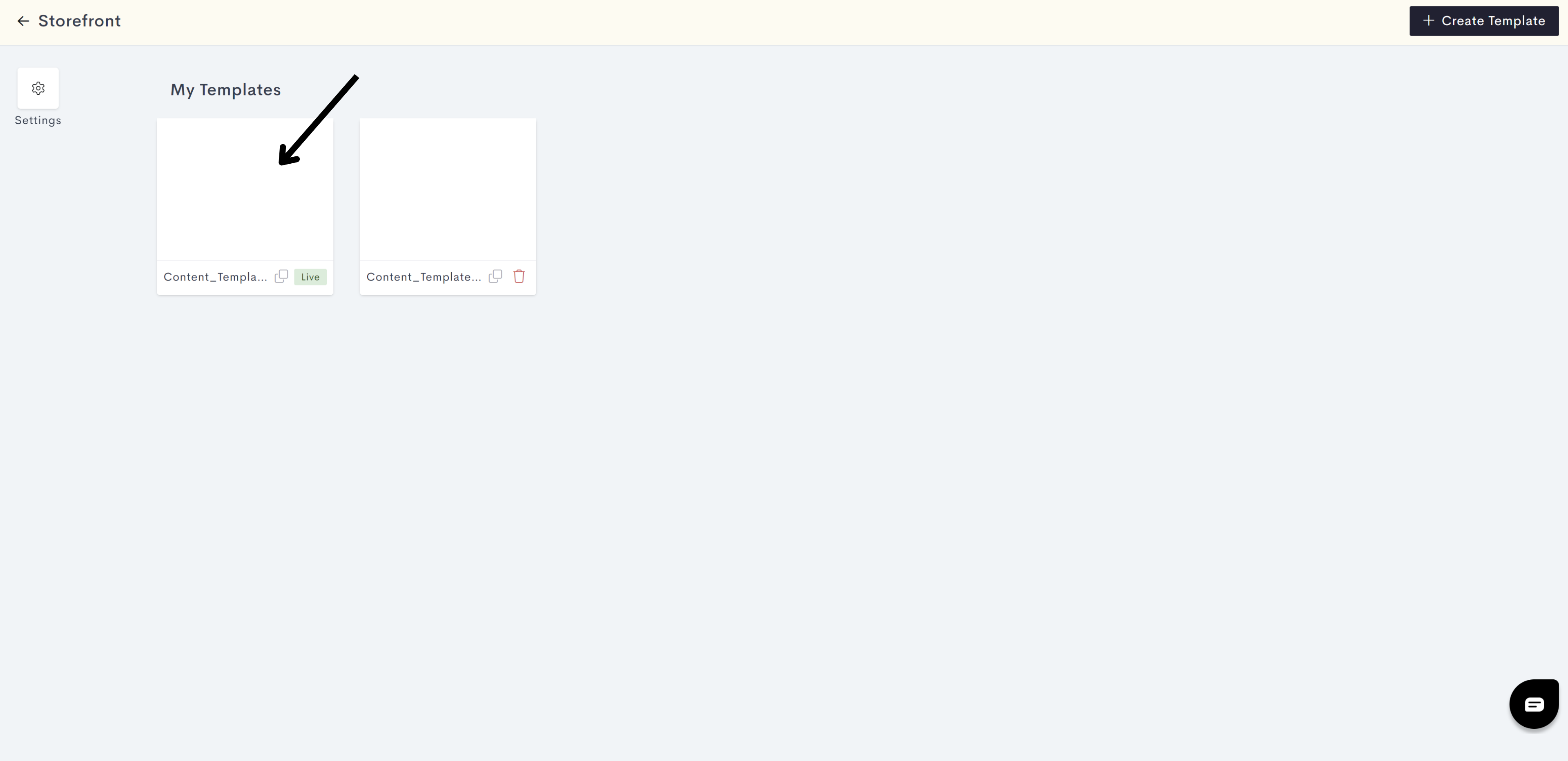
Log in to your aasaan desktop admin panel and click on Storefront.
a5c8.png?alt=media&token=5767efb7-f793-4c30-b24c-b38e7e0073c3)
STEP 2:
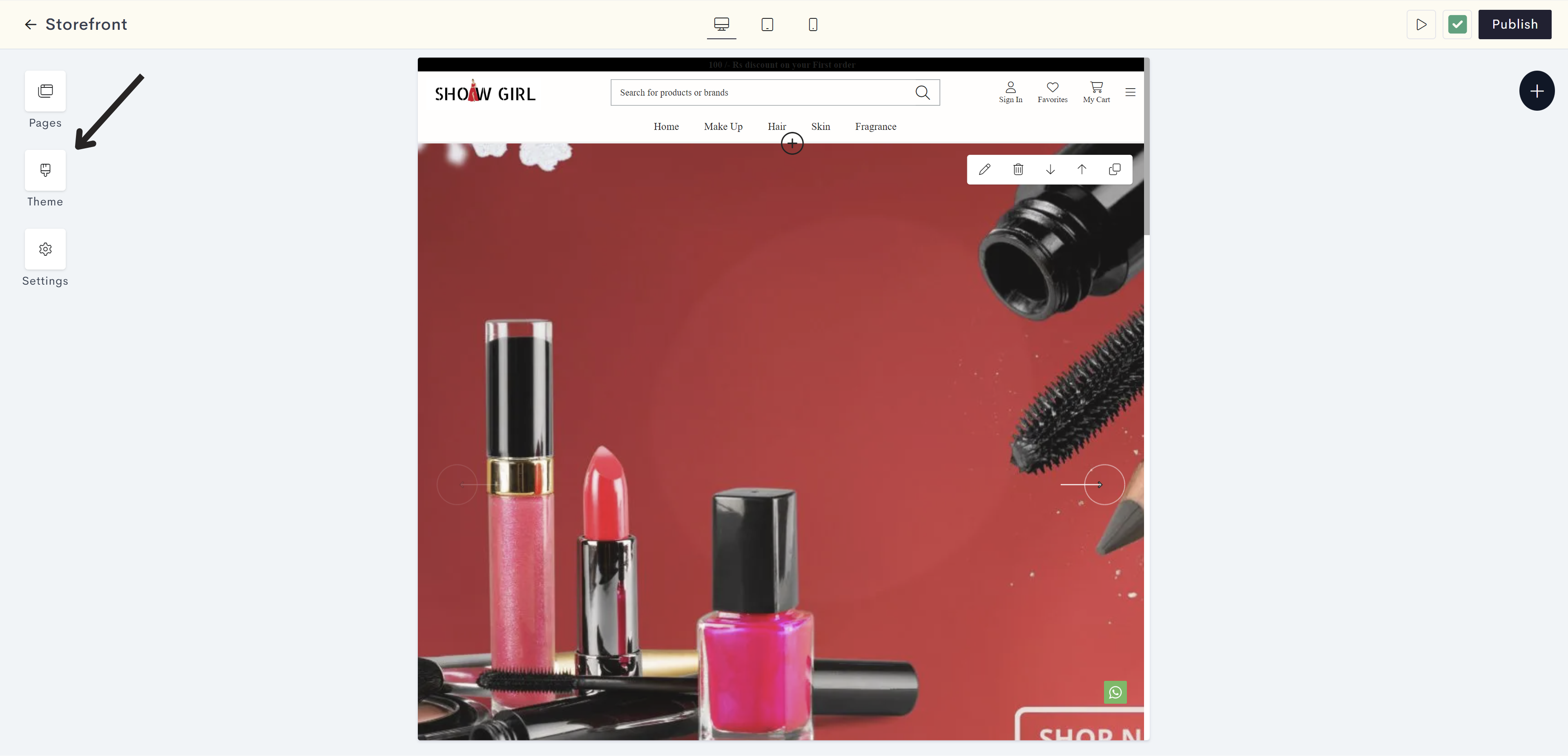
Click on the Content Template in which you wish to apply the Body Color. You can also click on Create Template, if you wish to create a new template for your website.
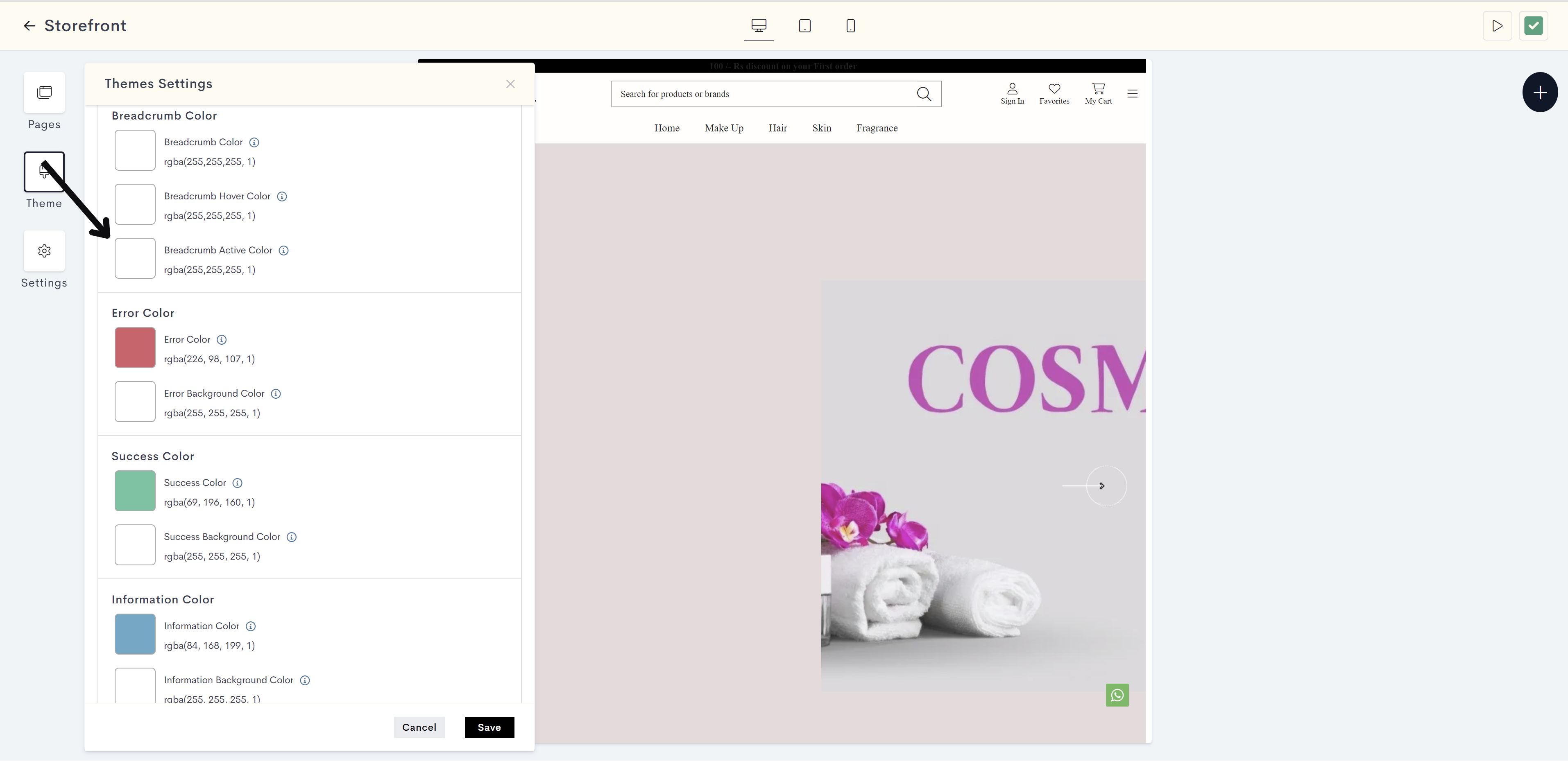
STEP 3:
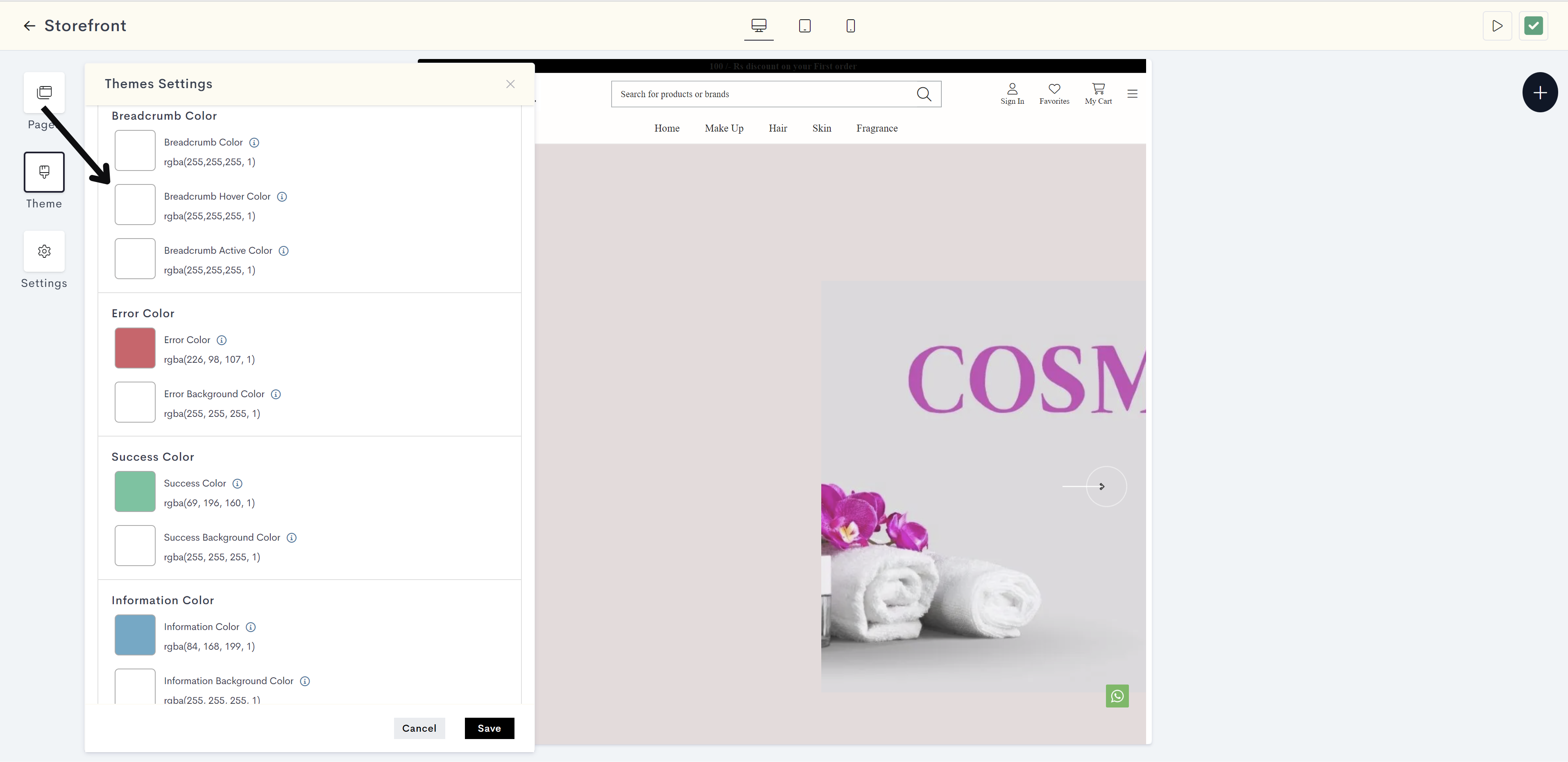
Click on Theme.
STEP 4:
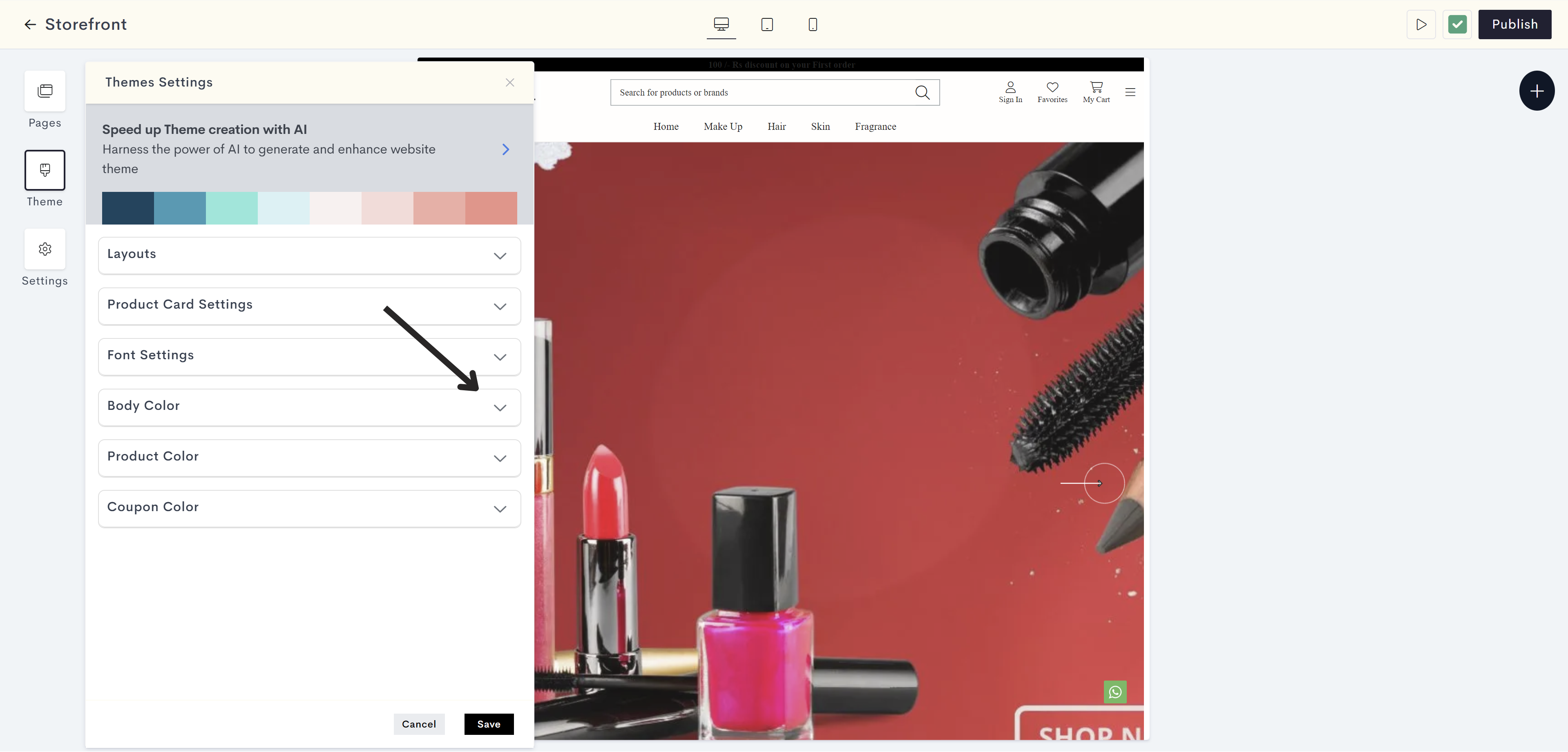
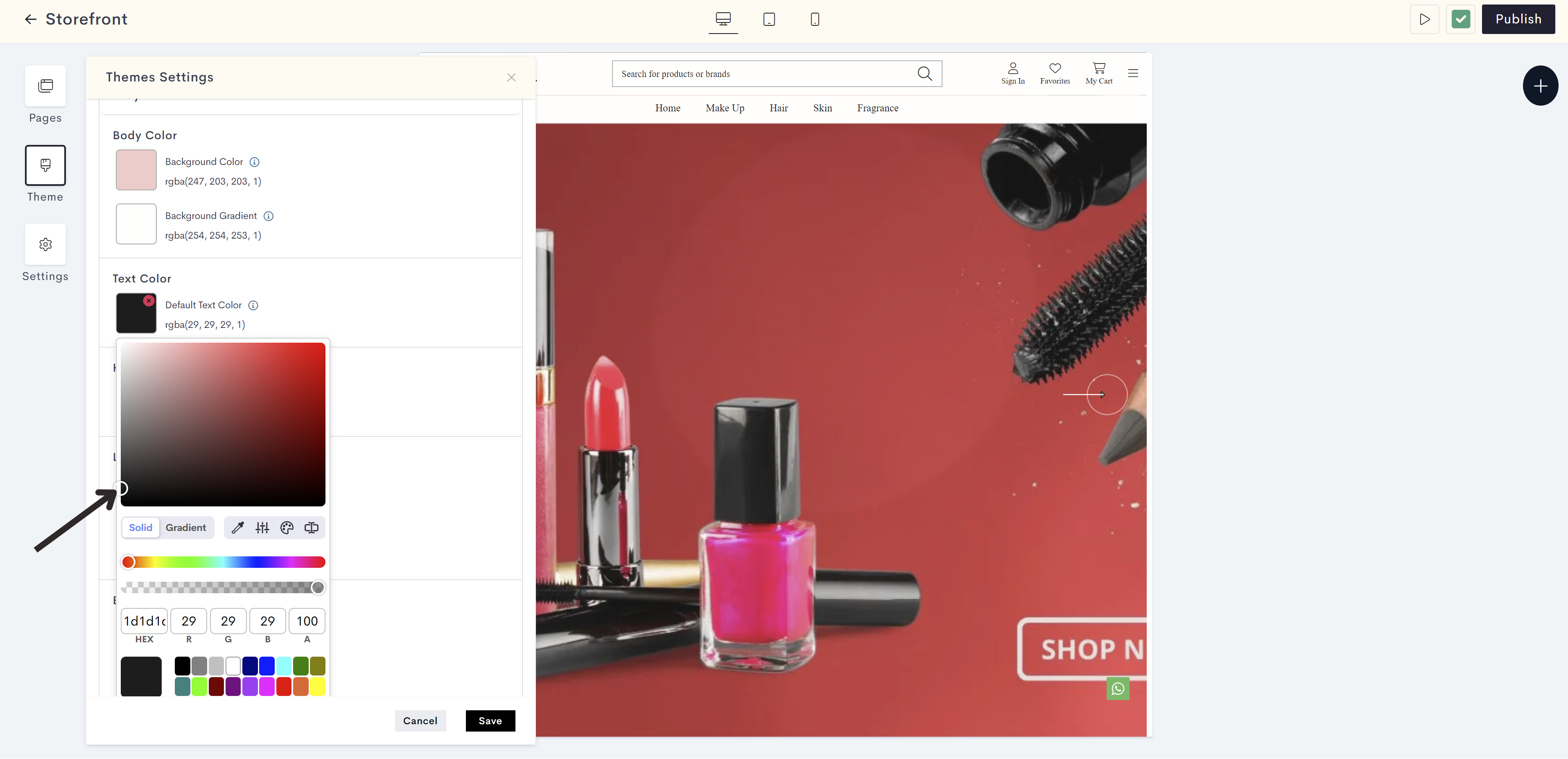
Click on the Body Color drop down.
STEP 5:
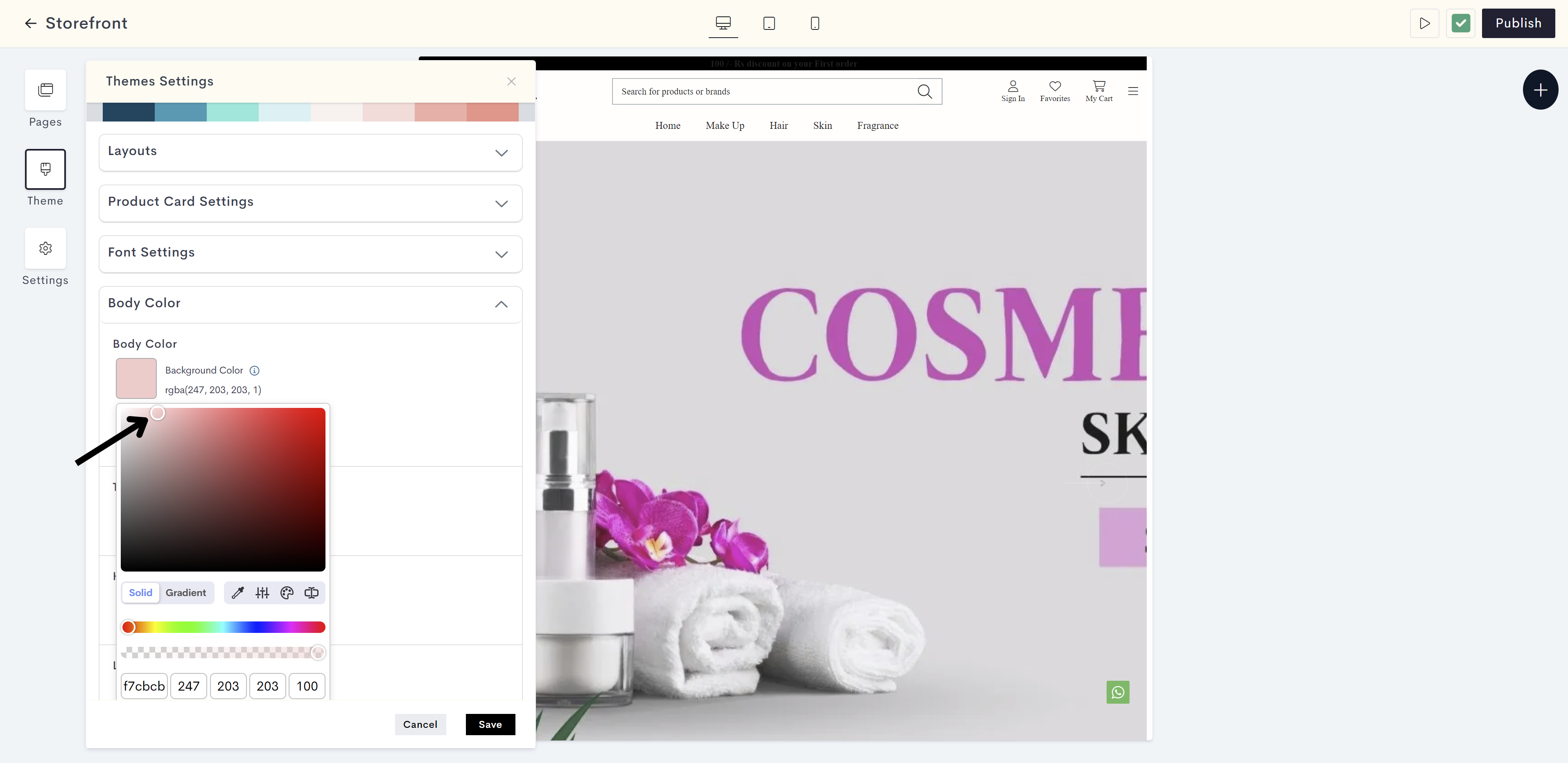
Click on Background Color to add the background color for the website.
f61e.png?alt=media&token=9030650c-3713-48bb-9879-14f0e5b854ca)
STEP 6:
Choose the body background color from the color palette or enter the color code manually.
The changes will be reflected on the background of your storefront. Please refer to fig: Background color.
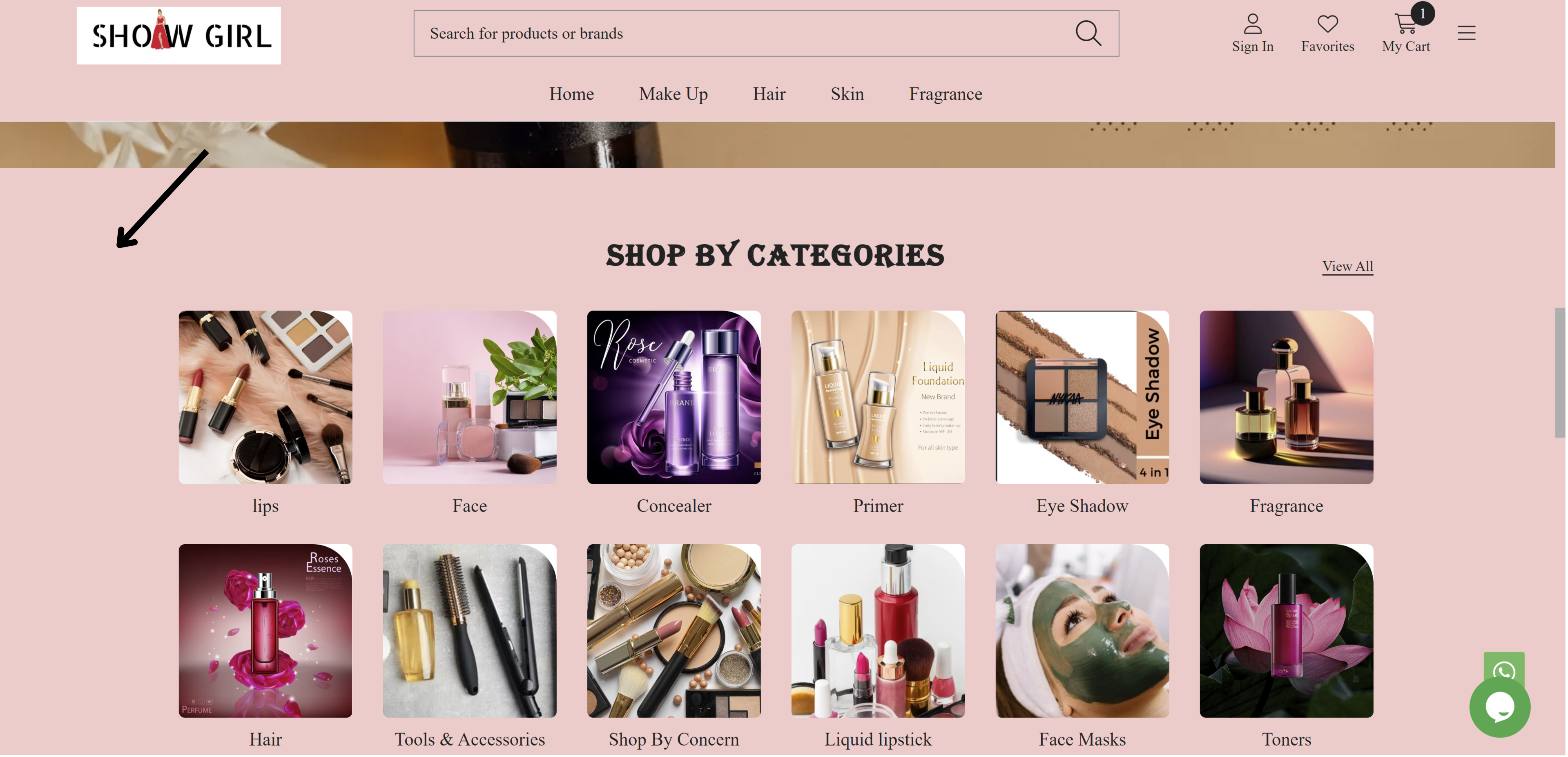
fig: Background color
STEP 7:
Click on Text Color to add foreground color for text on background colors.
Note: Text Color will reflect on foreground color for text on background for example Search, MSRP, Reviews Counts, SKU number etc. on your website.

STEP 8:
Choose the text color for the body from the color palette or enter the color code manually.
The changes will be reflected on the text on background of your storefront. Please refer to fig: Text color.
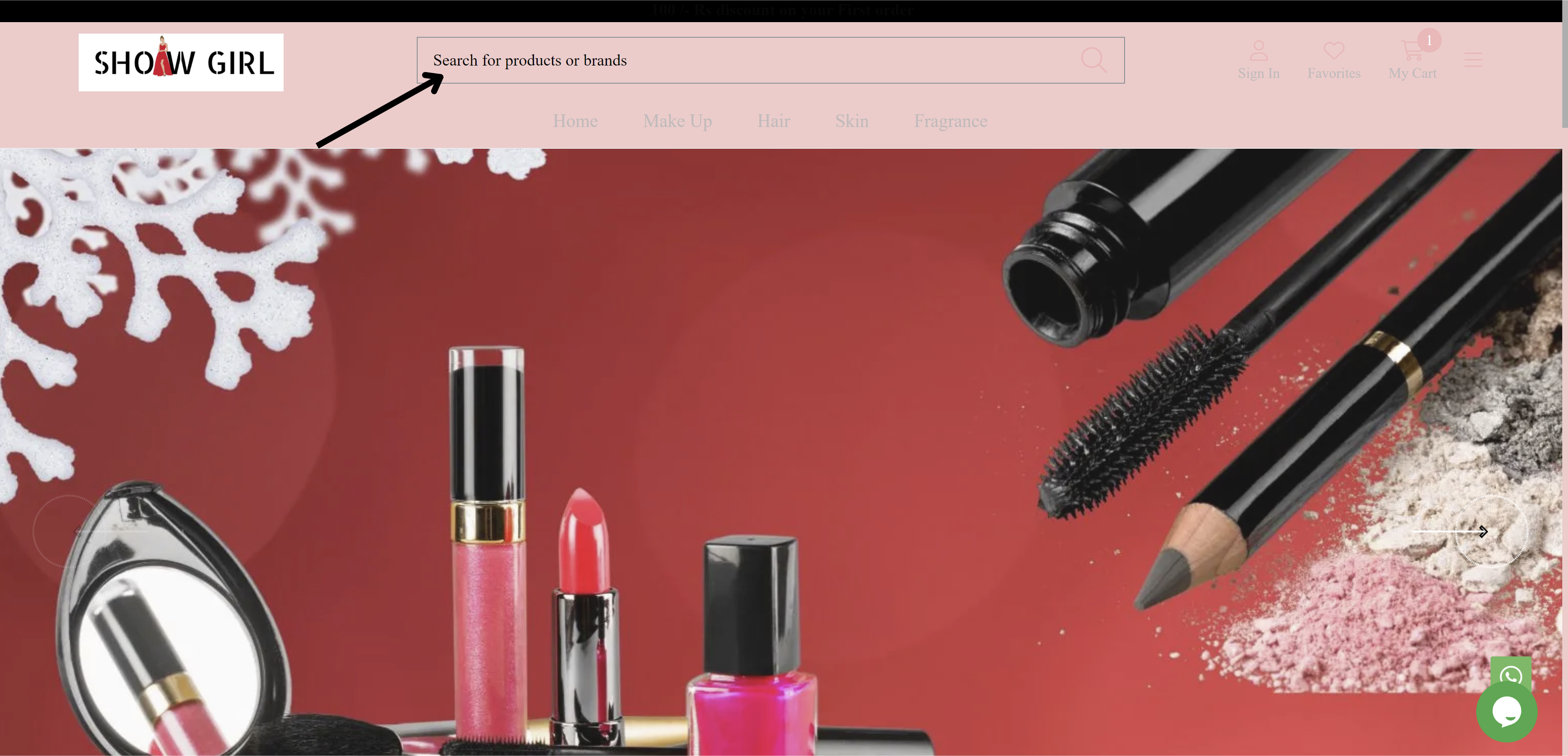
fig: Text color
STEP 9:
Click on Heading Color option to preset color for titles and headings on your website.
Note: Heading Color will reflect to all the titles and headings for example widgets, footer and side menu headings on your website.

STEP 10:
Choose the heading color for the Body from the color palette or enter the color code manually.
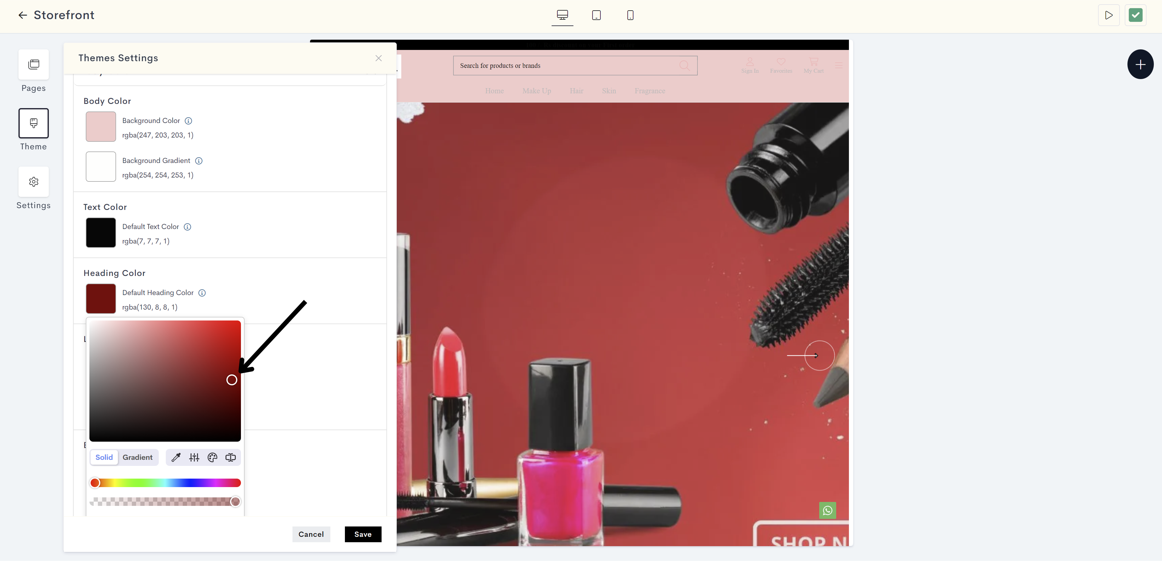
The changes will be reflected on the titles and headings on your website. Please refer to fig: Heading color.
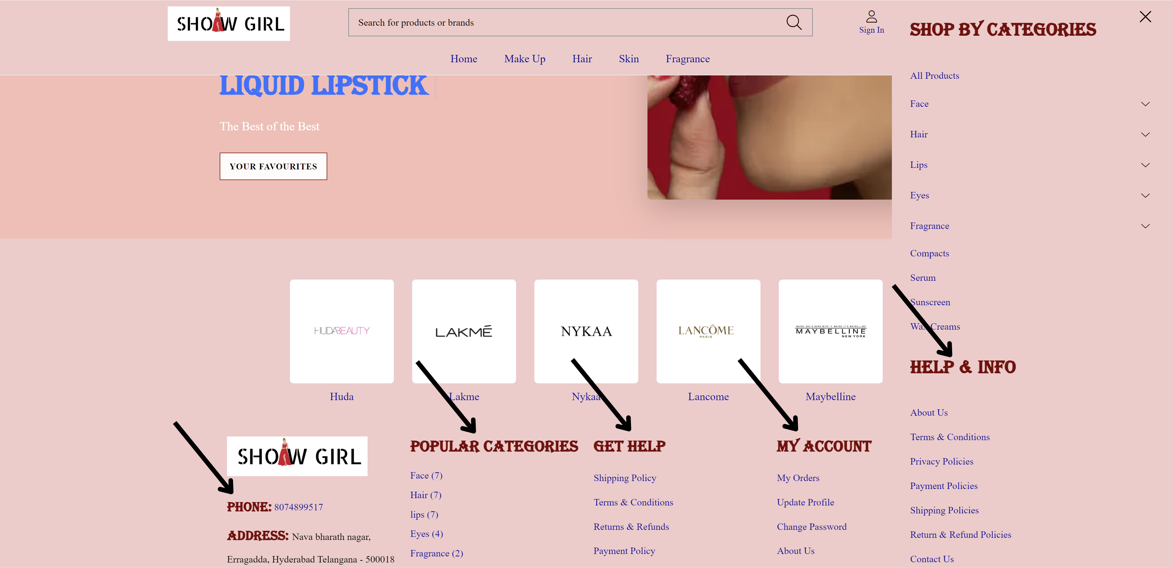
fig: Heading color
STEP 11:
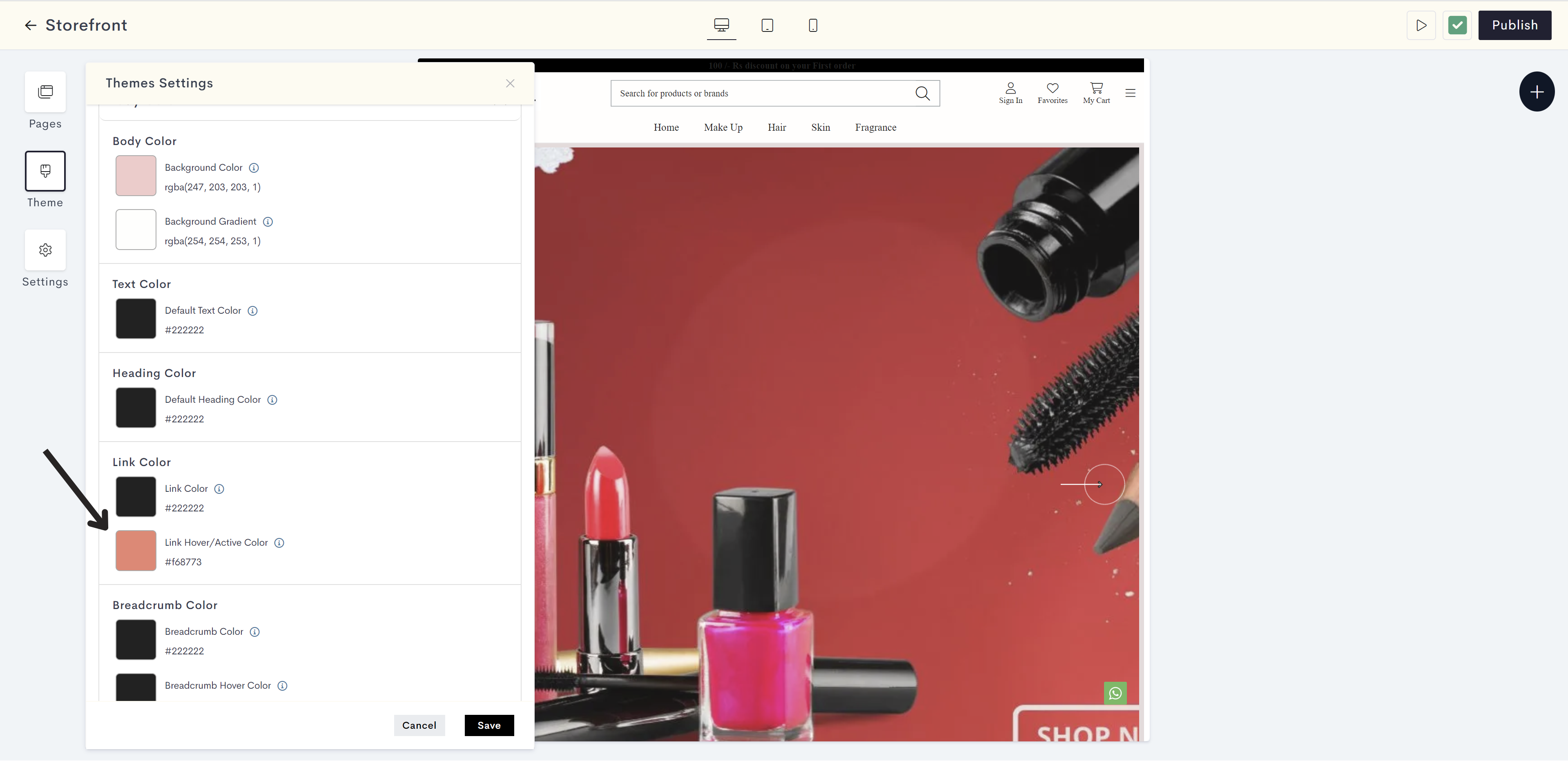
Click on Link Color to select the current color for clickable text (hyperlinks) on a website.

STEP 12:
Choose the link color from the color palette or enter the color code manually.
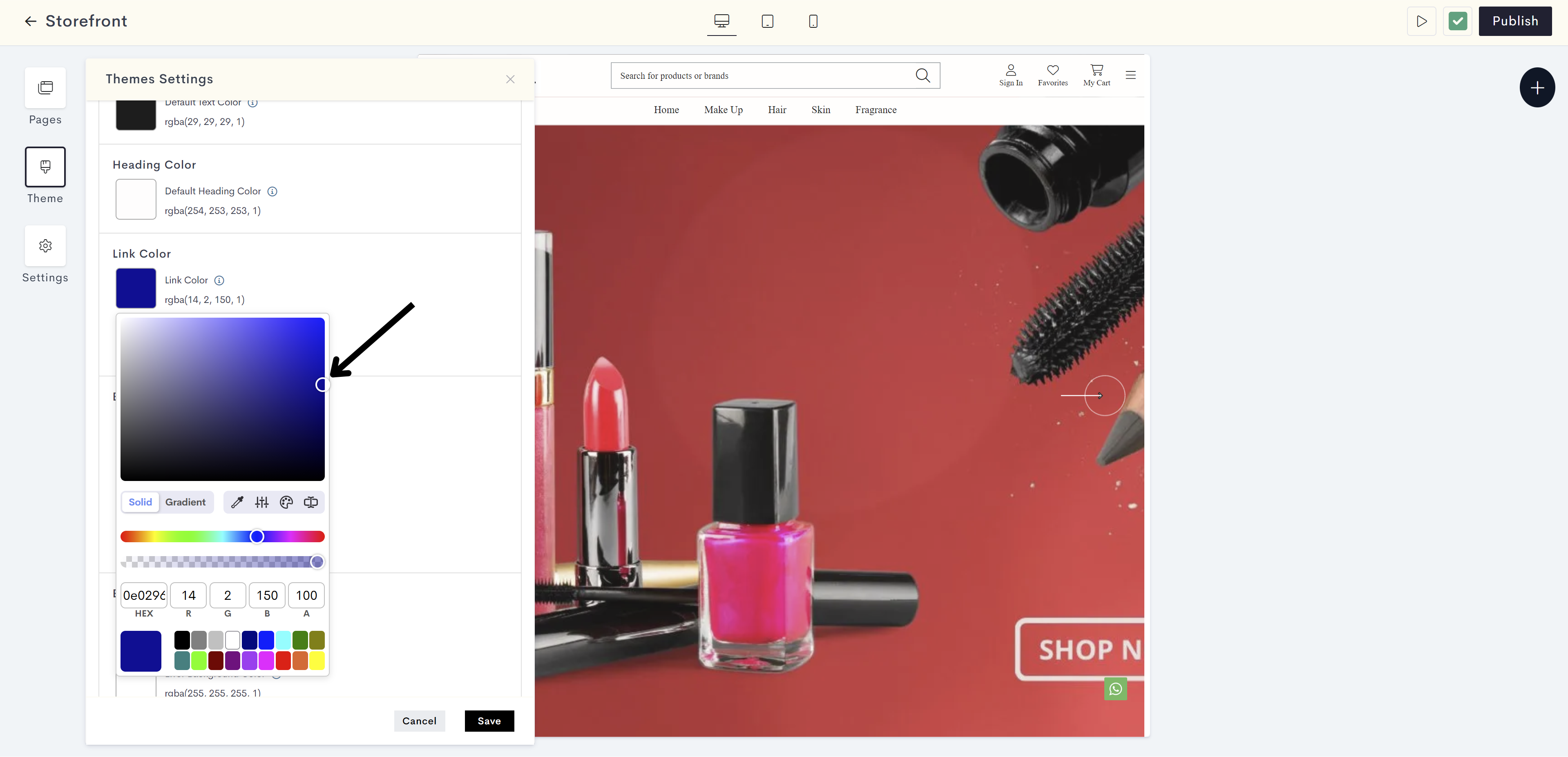
The changes will be reflected on clickable text (hyperlinks) on a website. Please refer to fig: Link color.
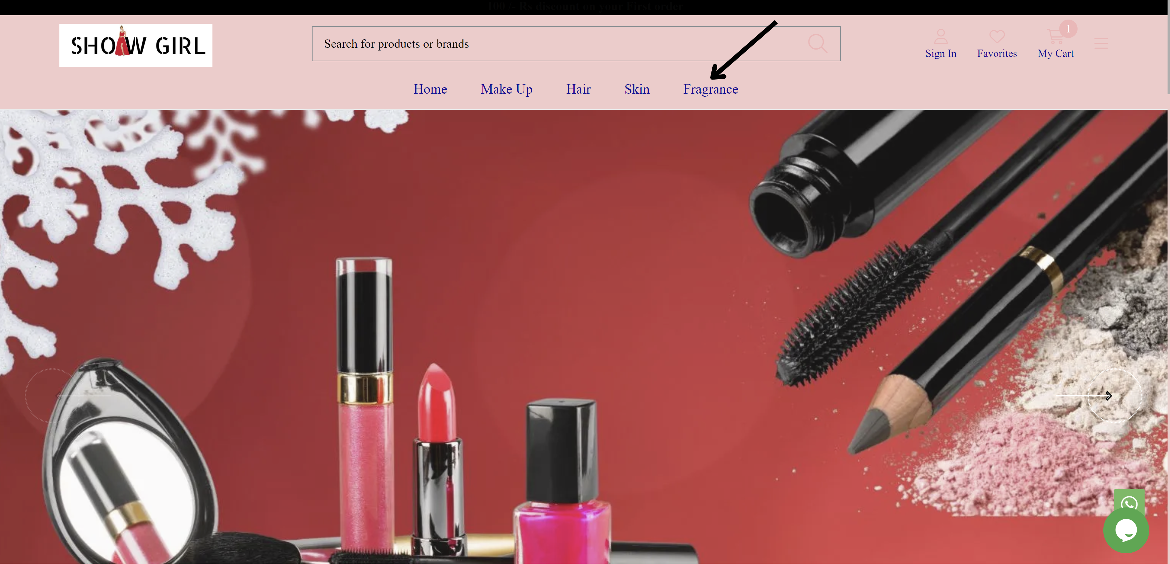
fig: Link color
STEP 13:
Click on Link Hover/Active Color for changing the color of clickable text when hovering or clicking.
Note: Hover color refers to the change in color of an element (such as a button or link) when a user hovers their cursor over it.
STEP 14:
Choose the link hover/active color from the color palette or enter the color code manually.
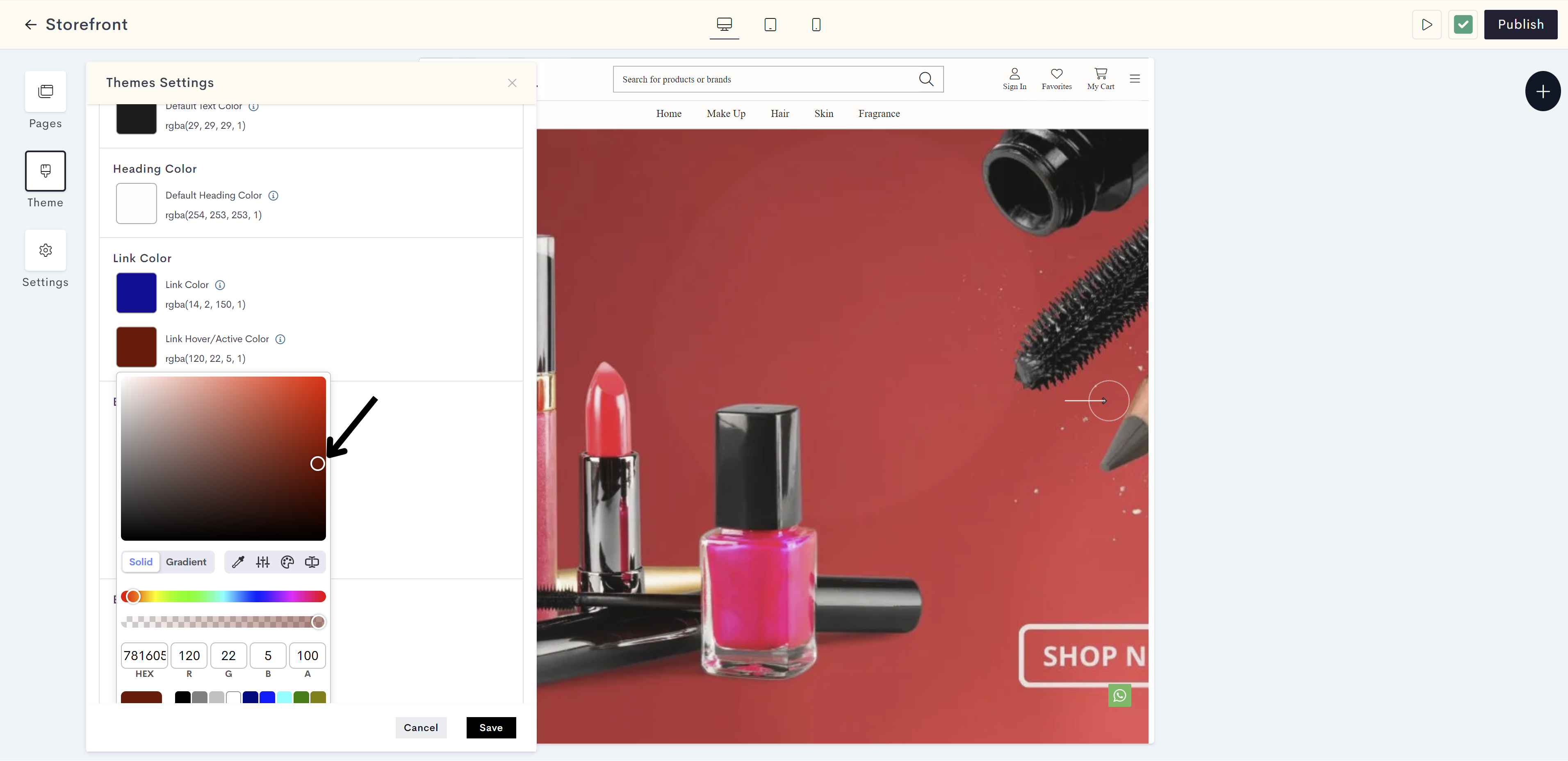
The changes will be reflected on clickable text (hyperlinks) on a website when hovering or clicking. Please refer to fig: Link hover color.
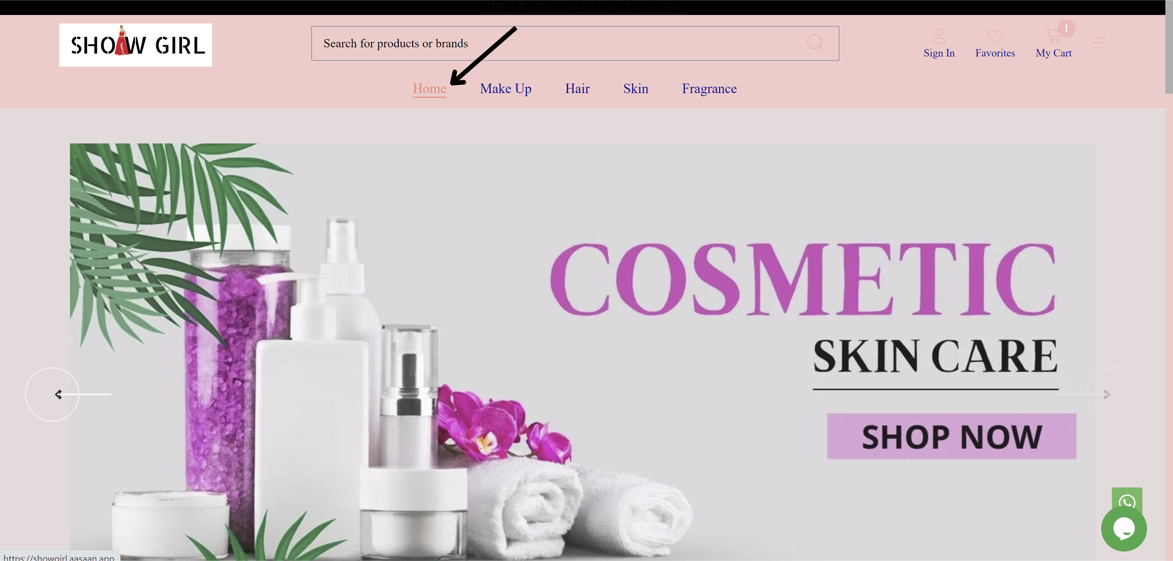
fig: Link hover color
STEP 15:
Click on Breadcrumb Color for displaying the color of the navigation trail on a website.
Note: A breadcrumb is a user interface element that displays a trail of clickable links. It allows users to easily retrace their steps and navigate back to previous pages or section.
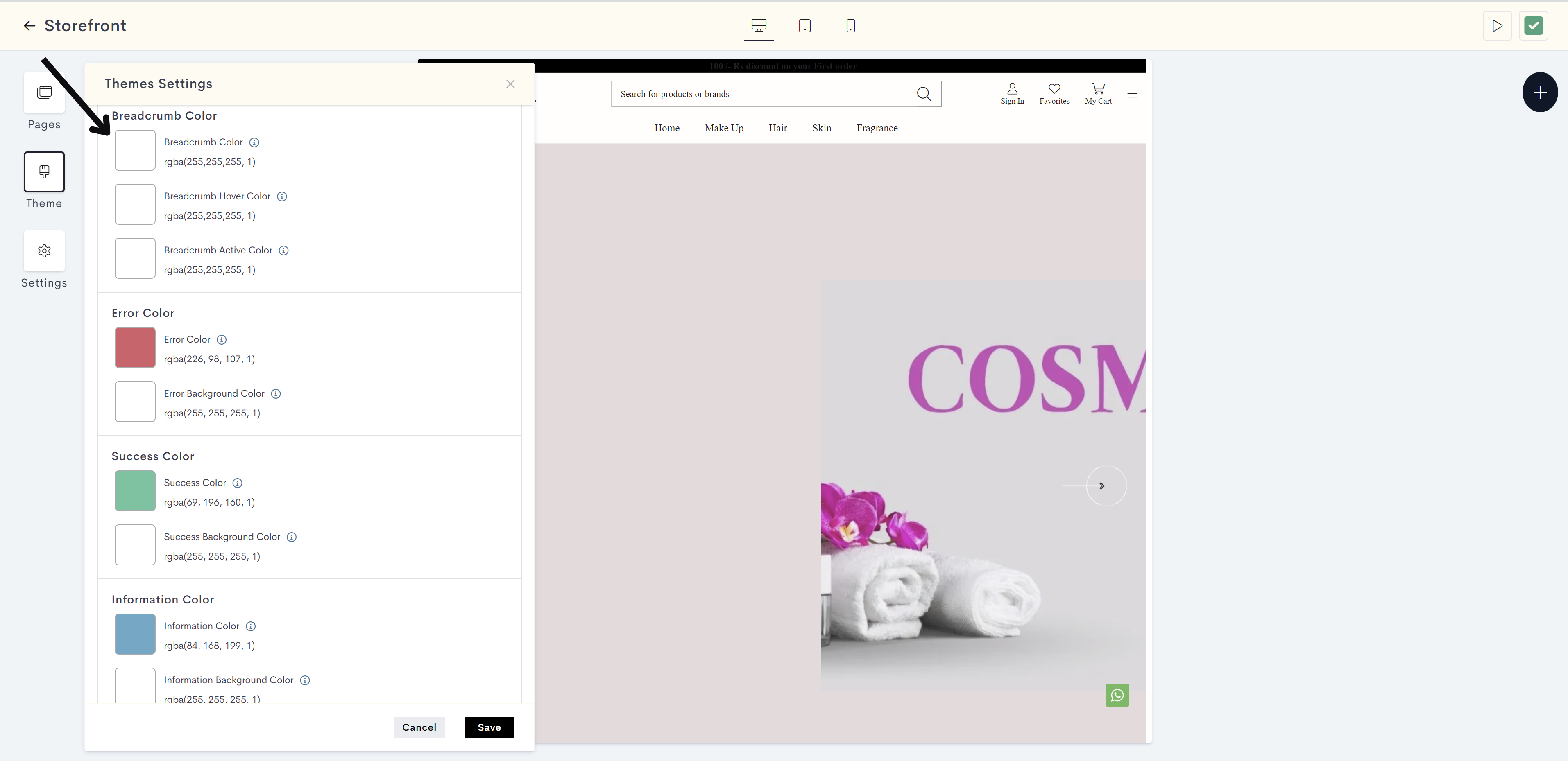
STEP 16:
Choose the breadcrumb color from the color palette or enter the color code manually.
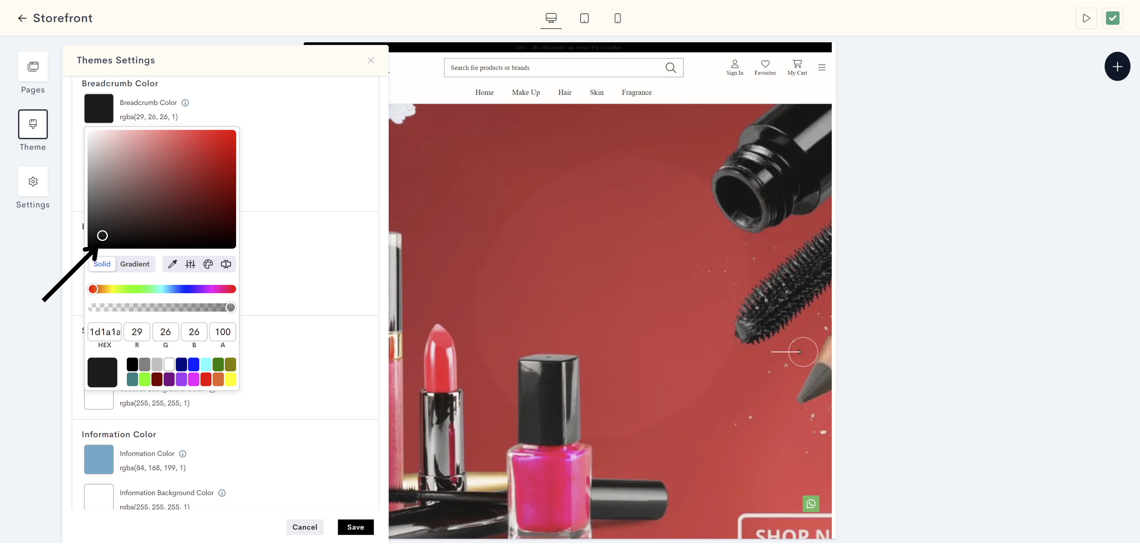
The changes will be reflected on Breadcrumb on a website. Please refer to fig: Breadcrumb color.
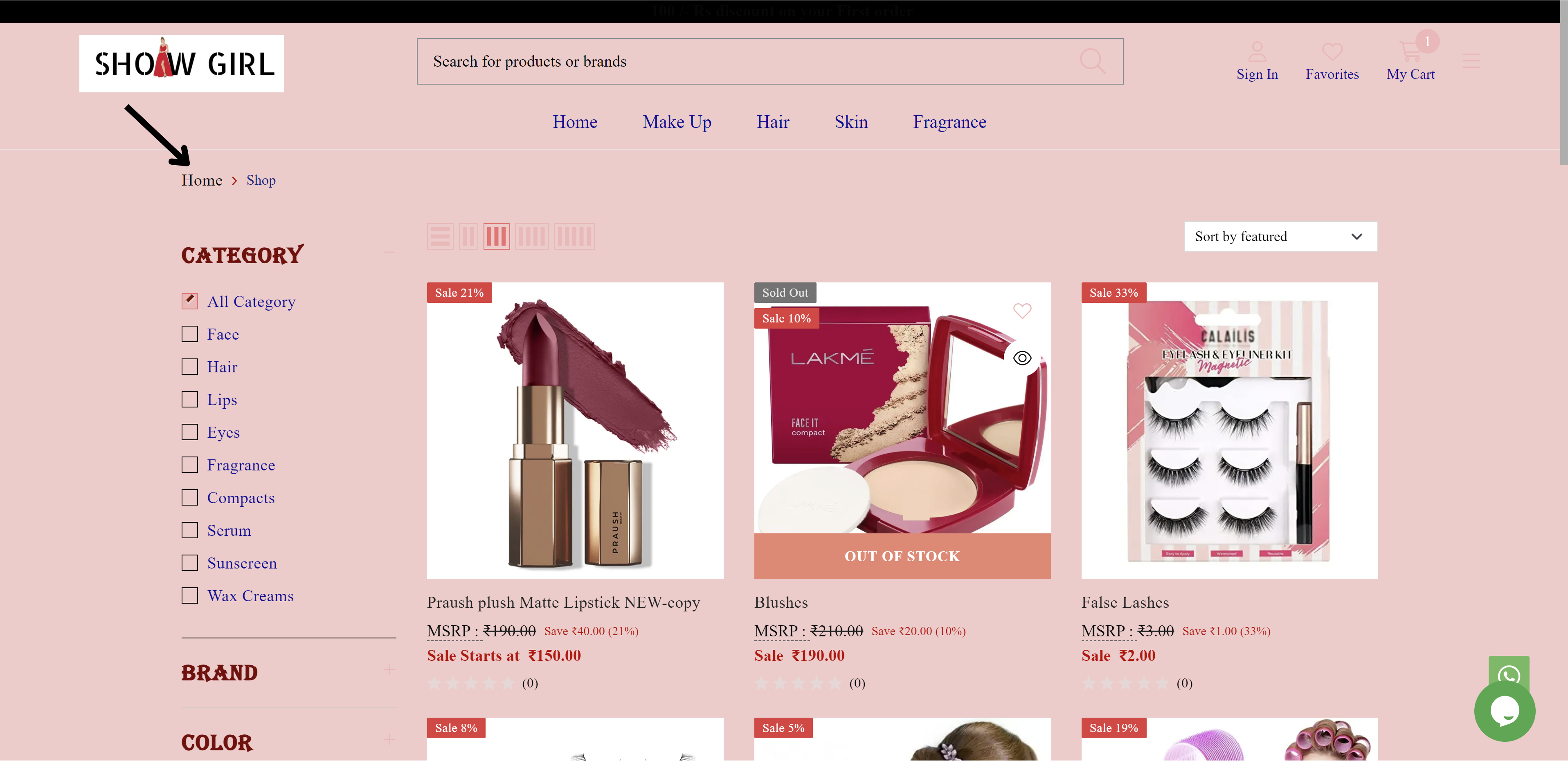
fig: Breadcrumb color
STEP 17:
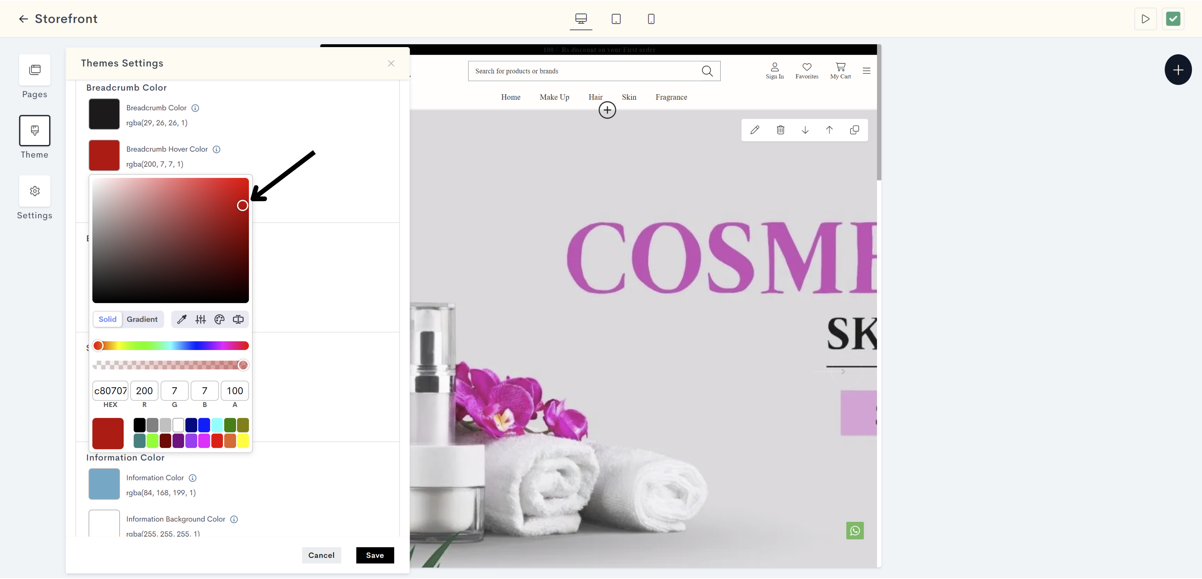
Click on the Breadcrumb Hover Color for showing the color when hovering over a navigation trail link.
STEP 18:
Choose the breadcrumb hover color from the color palette or enter the color code manually.
STEP 19:
Click on Breadcrumb Active Color for indicating the color of the current or active navigation trail link.
STEP 20:
Choose the breadcrumb active color from the color palette or enter the color code manually.
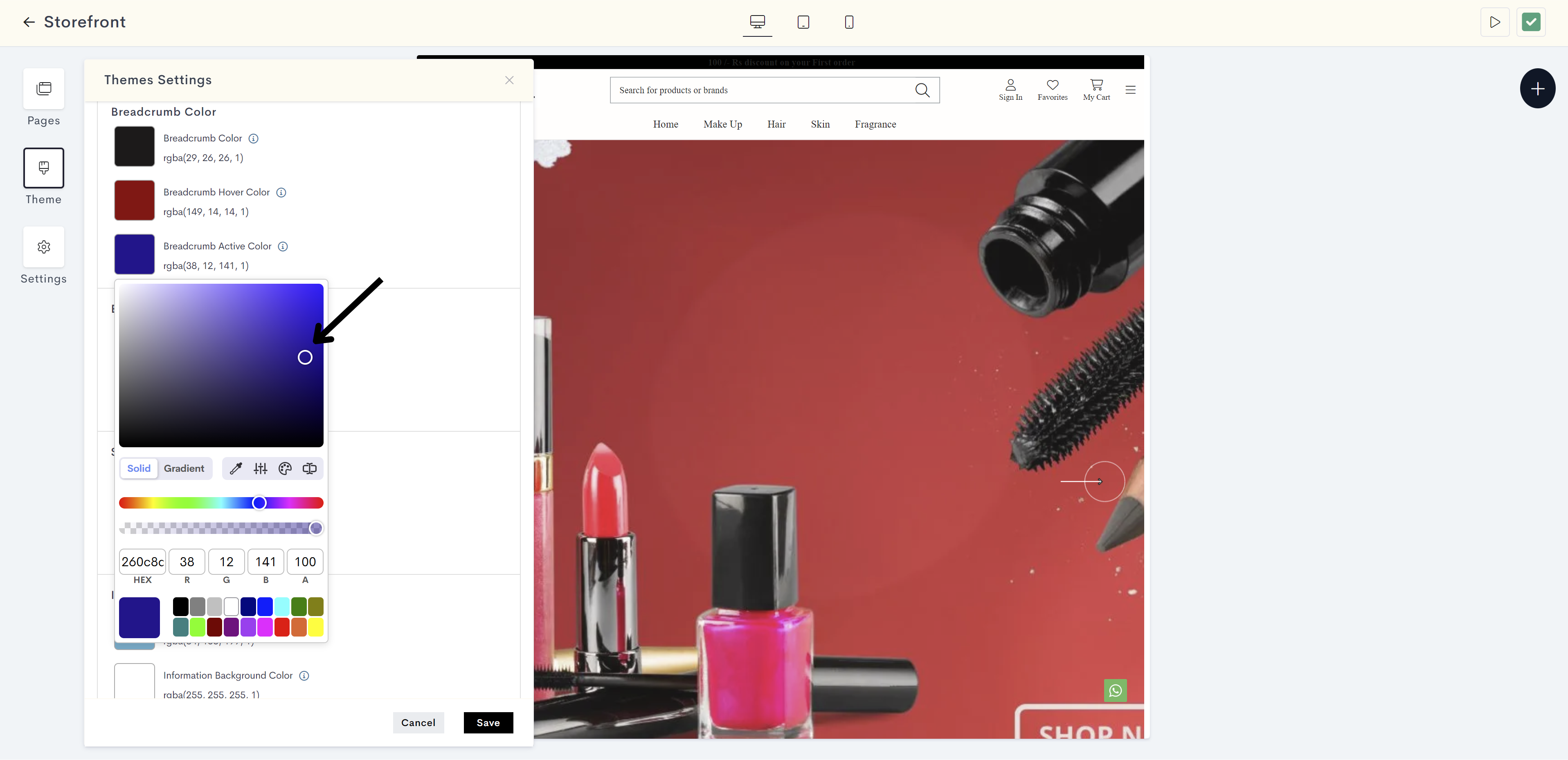
The changes will be reflected on the current or active navigation trail link website. Please refer to fig: Breadcrumb active color.
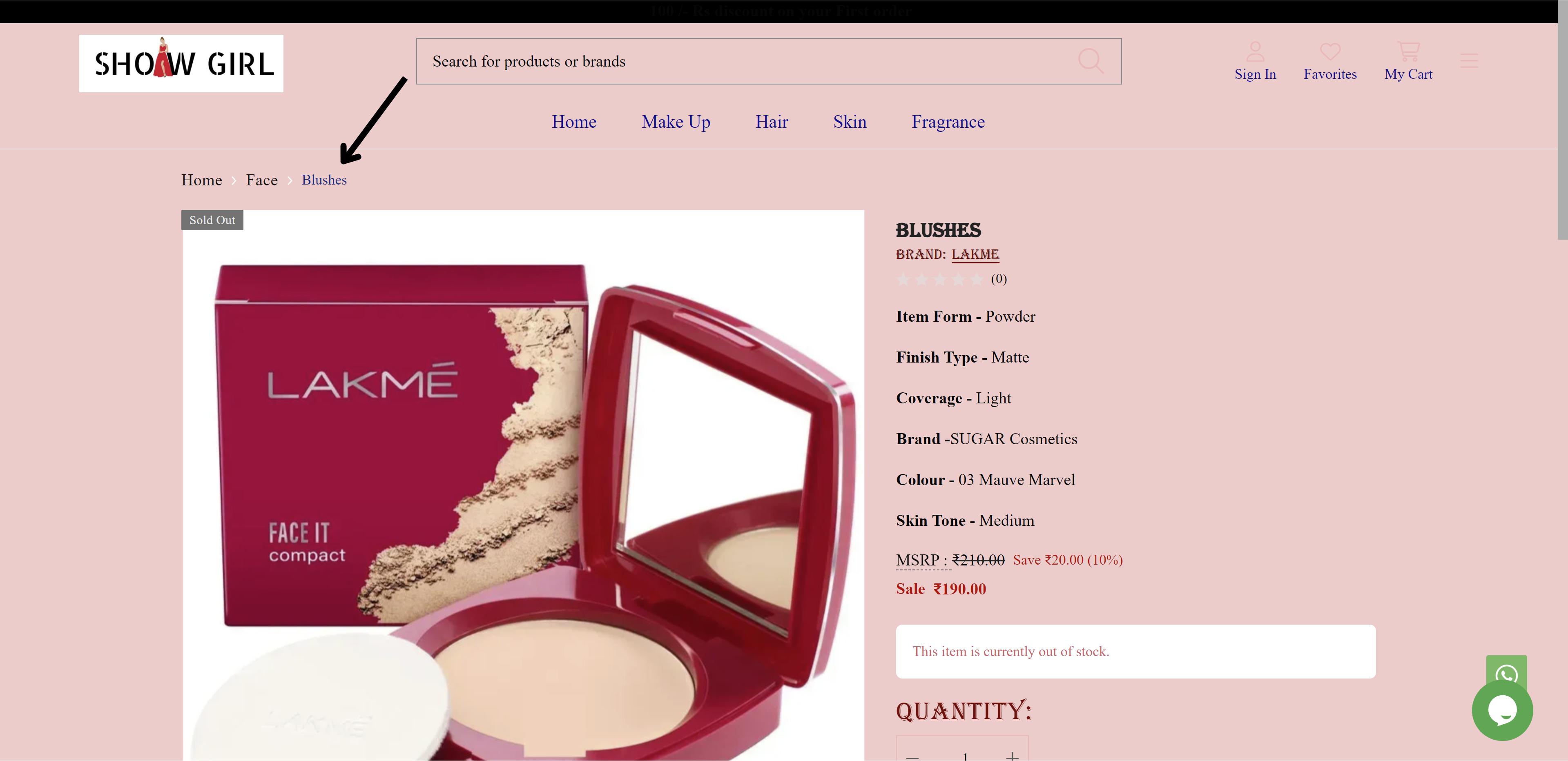
fig: Breadcrumb active color
STEP 21:
Click on Success Color. It is used to indicate positive or successful outcomes or elements.
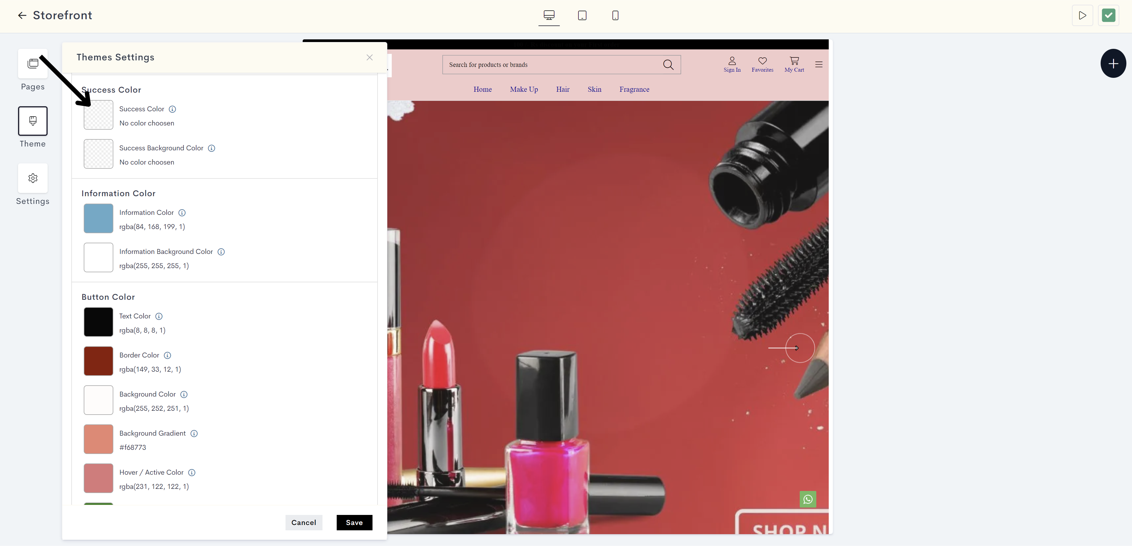
STEP 22:
Choose the success color from the color palette or enter the color code manually.
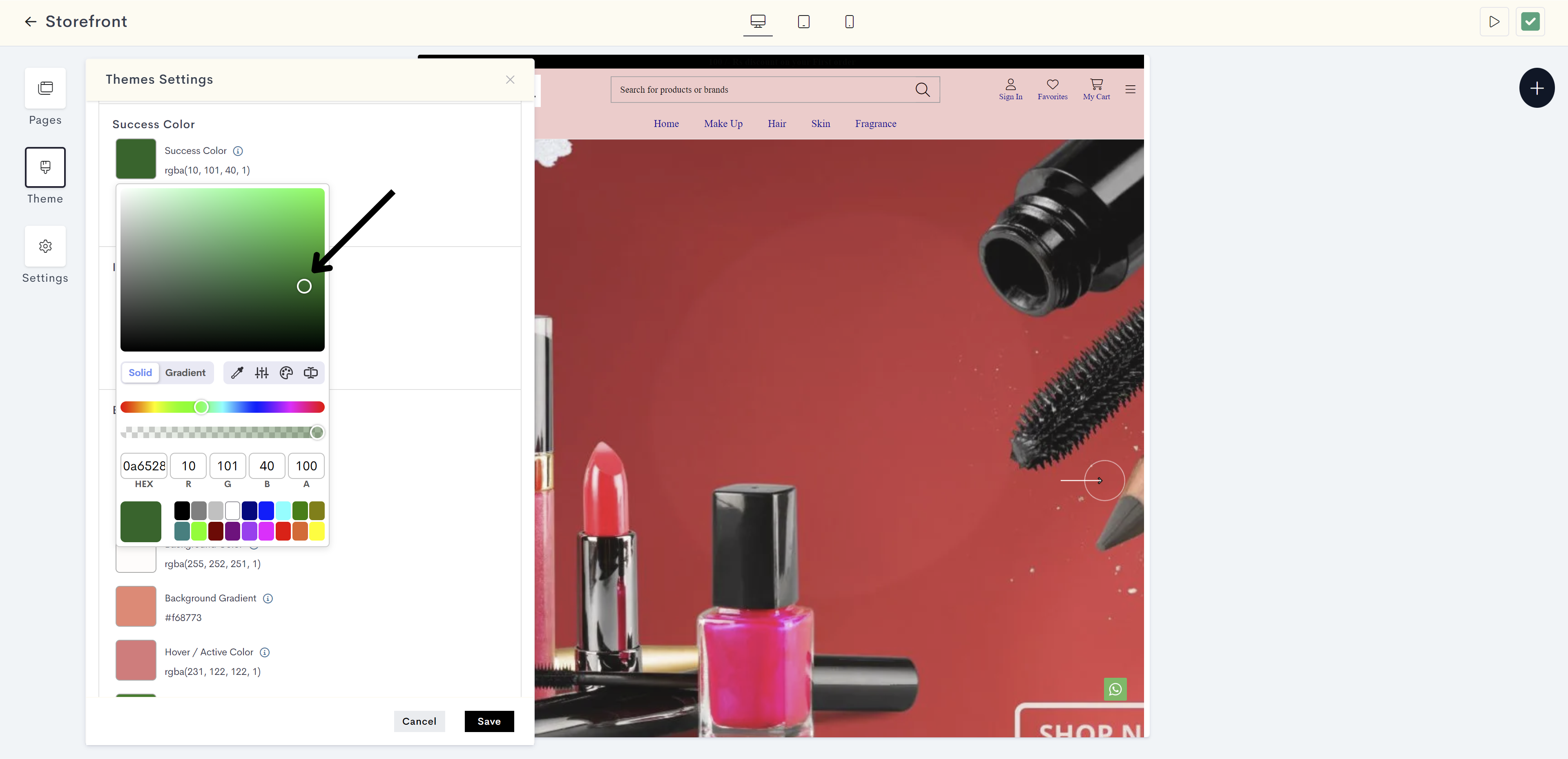
The changes will be reflected on successful outcomes on the website(for example, product has been added to your cart). Please refer to fig: Success color.
db23.png?alt=media&token=afdb960e-48d9-4e52-91da-2adf4d48859b)
fig: Success color
STEP 23:
Click on Success Background Color. It is used to highlight the background of elements with successful outcomes.
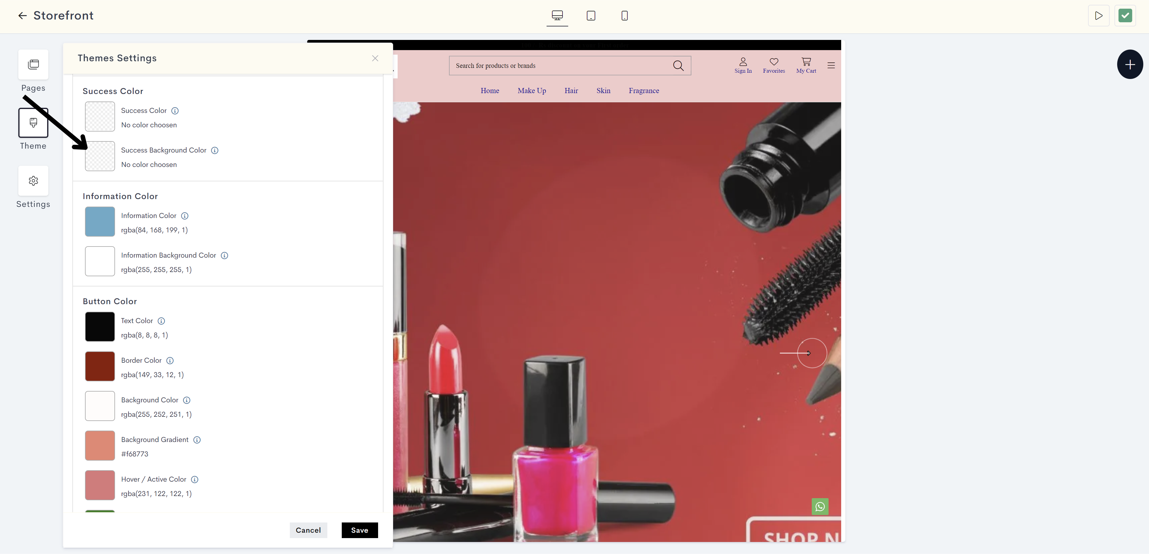
STEP 24:
Choose the success background color from the color palette or enter the color code manually.
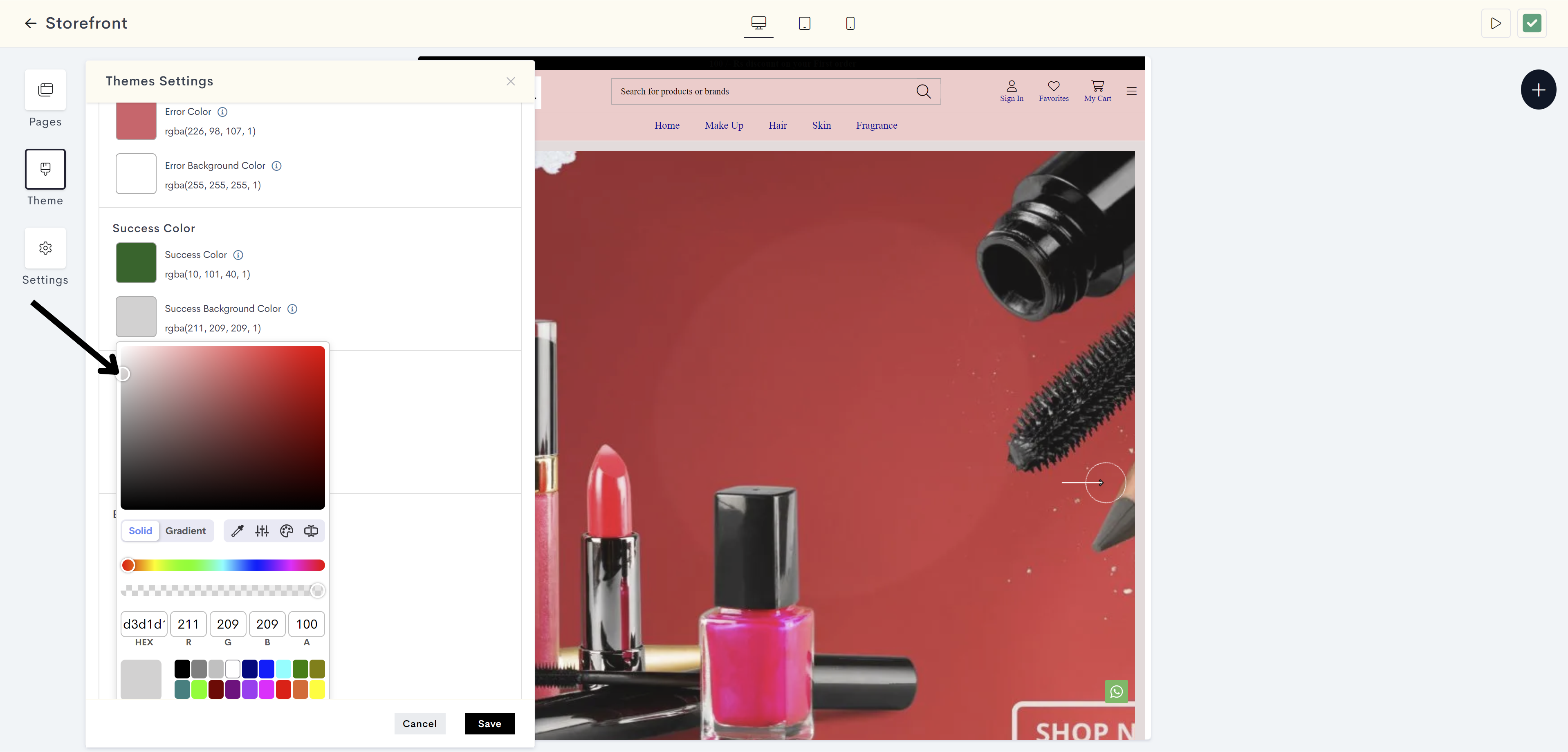
The changes will be reflected on background of successful outcomes on the website(for example, product has been added to your cart). Please refer to fig: Success background color.
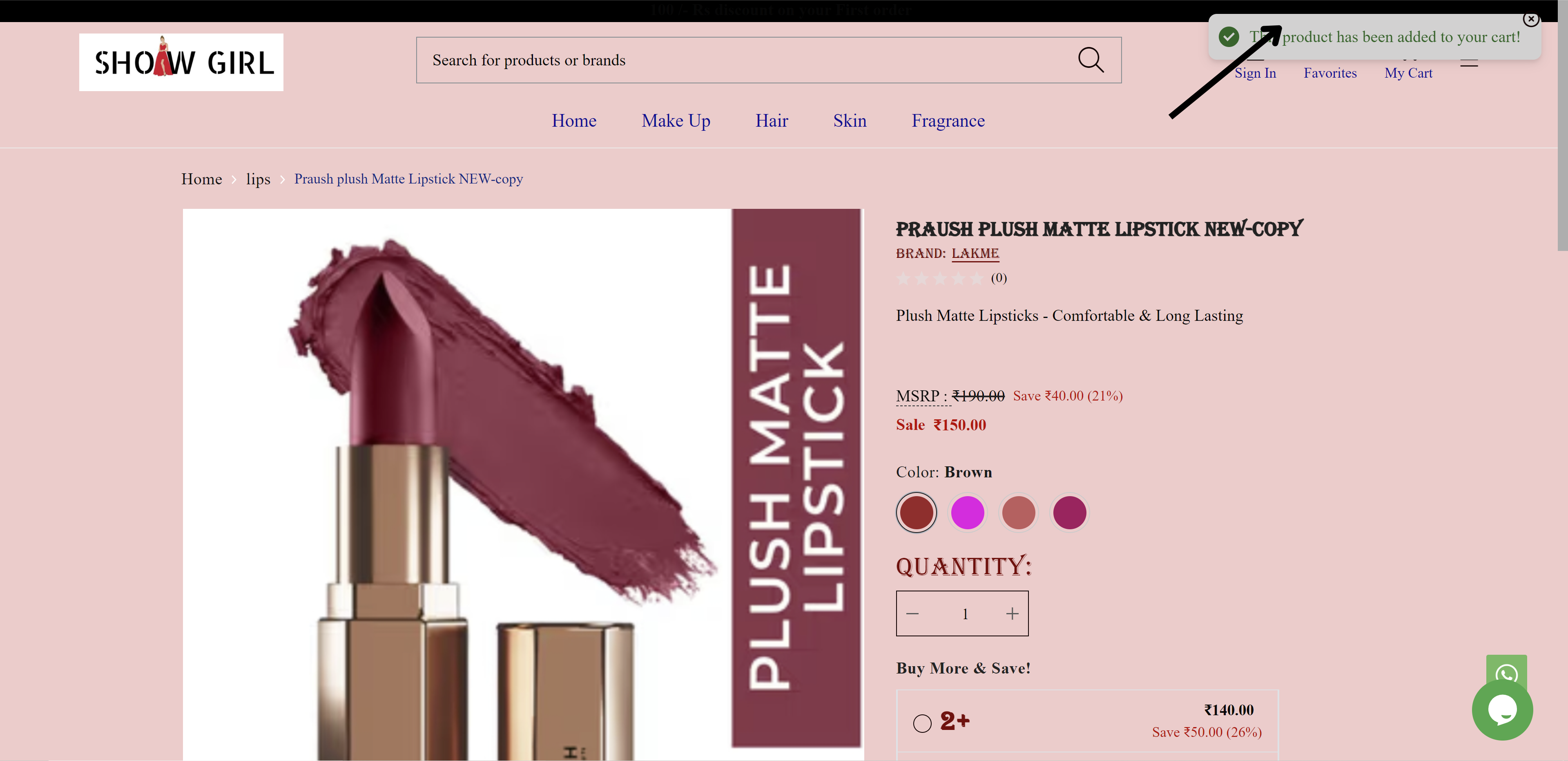
fig: Success background color
STEP 25:
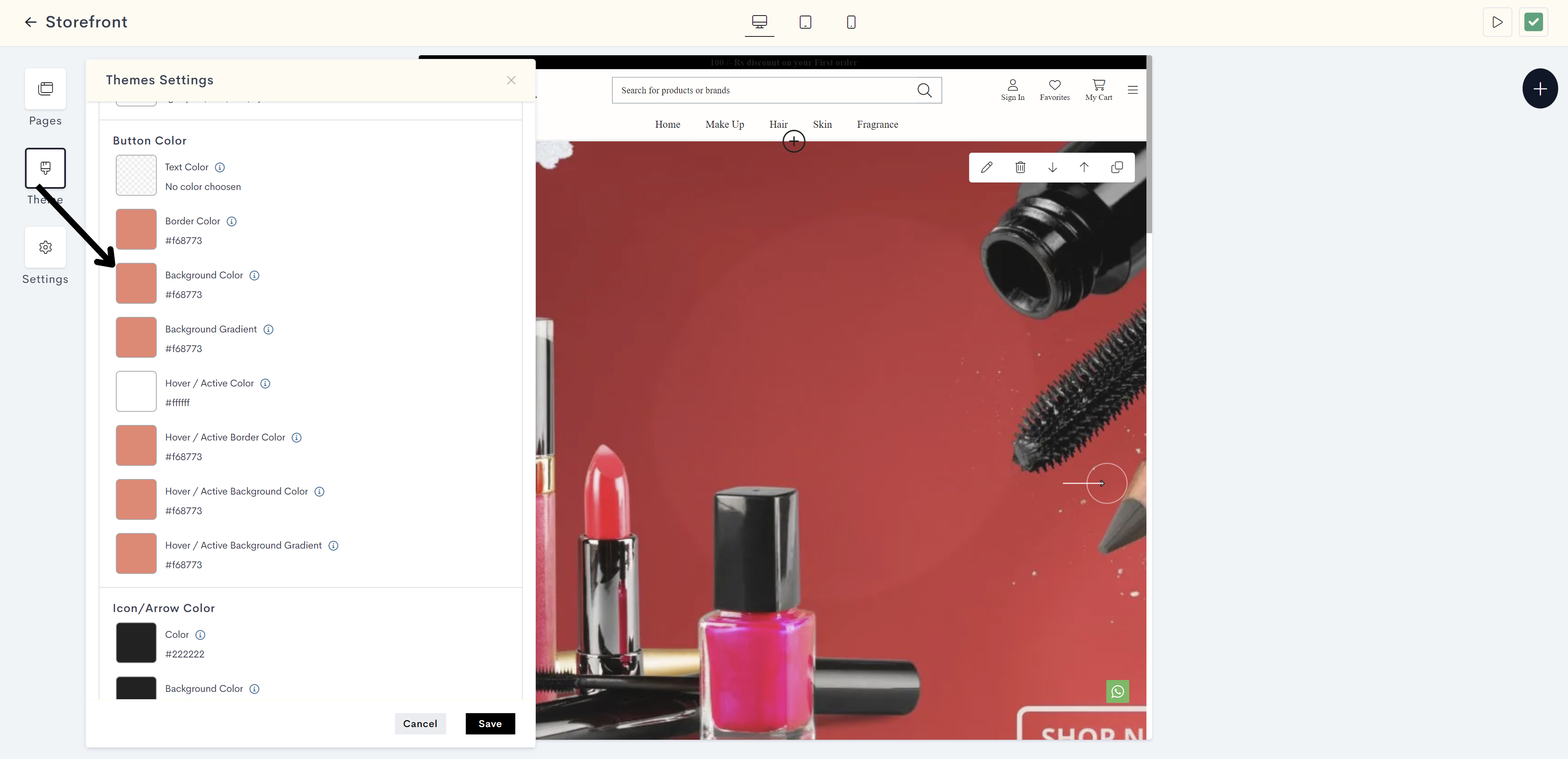
Button Color:
Click on the Text Color to set the color of the text within a button.
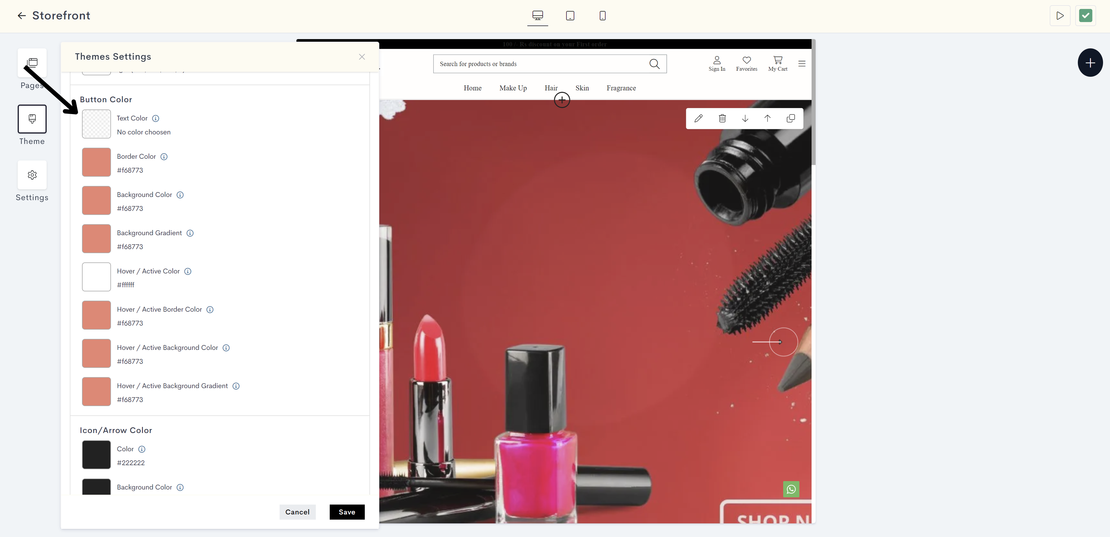
STEP 26:
Choose the text color from the color palette or enter the color code manually.
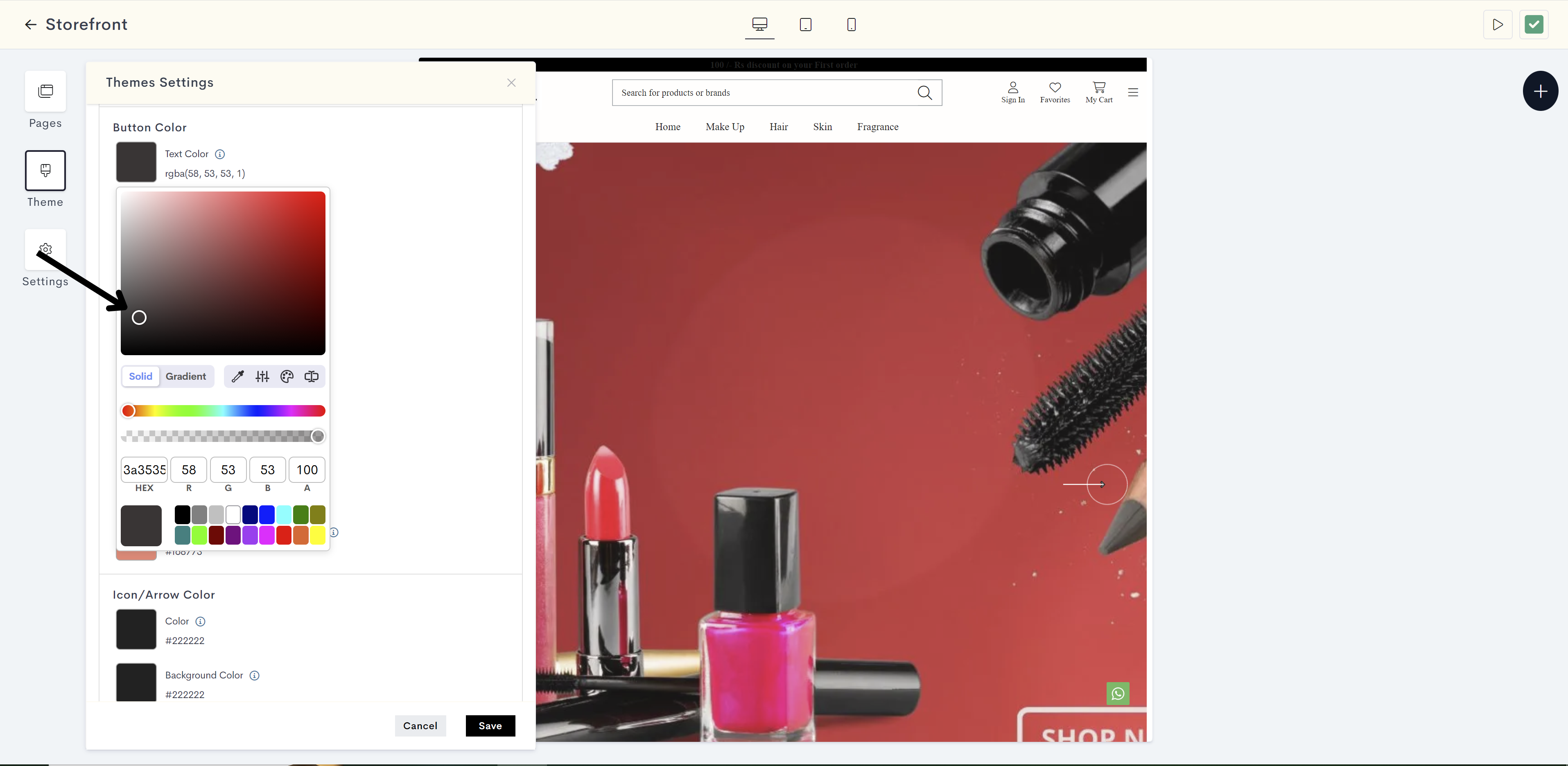
The changes will be reflected on text of button on your website. Please refer to fig: Button text color.
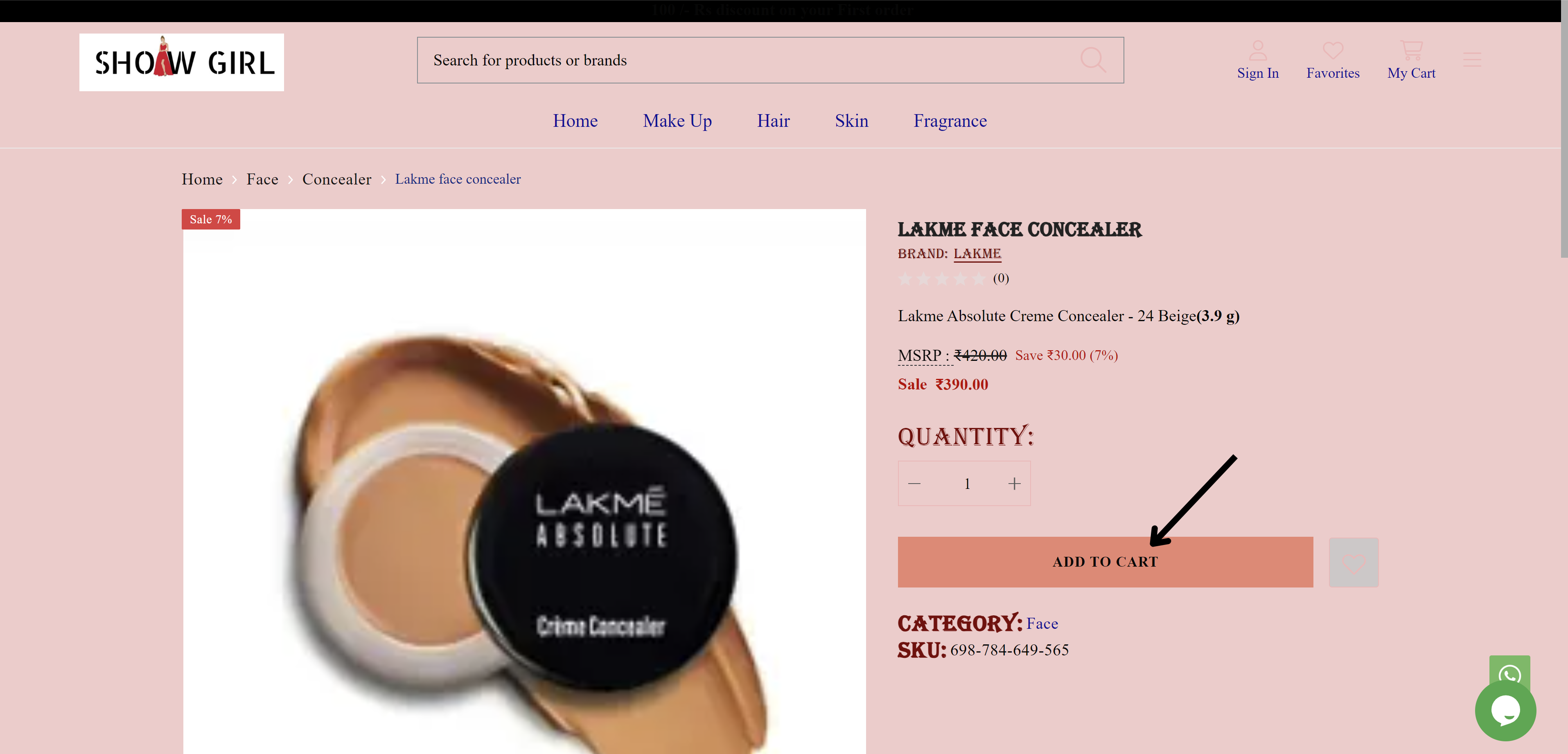
fig: Button text color
STEP 27:
Click on Border Color to define the color of the button's border.

STEP 28:
Choose the border color from the color palette or enter the color code manually.
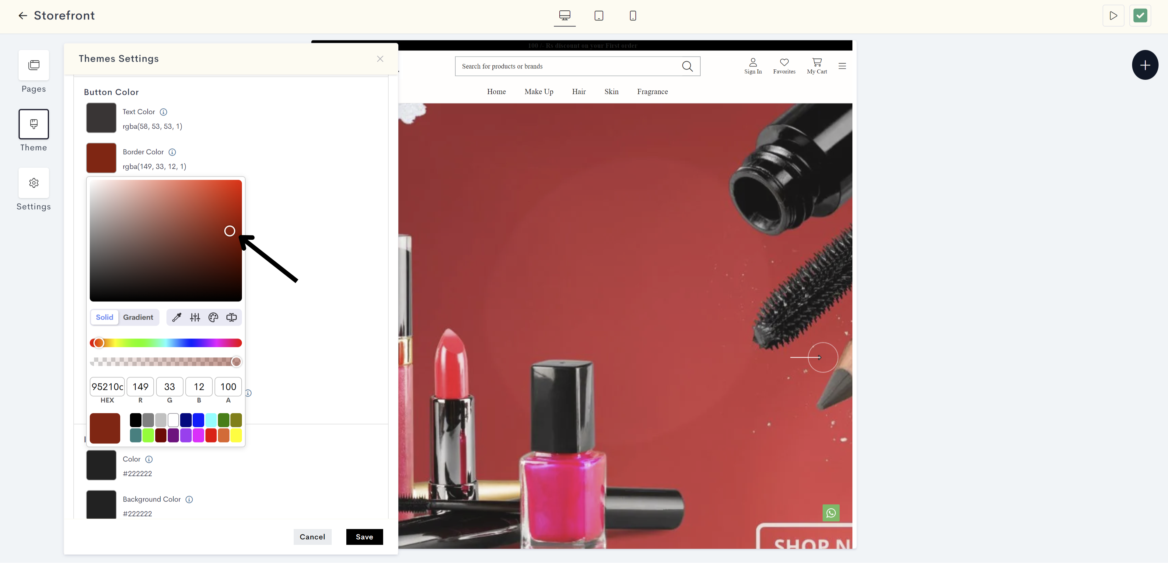
The changes will be reflected on border of button on your website. Please refer to fig: Border color.
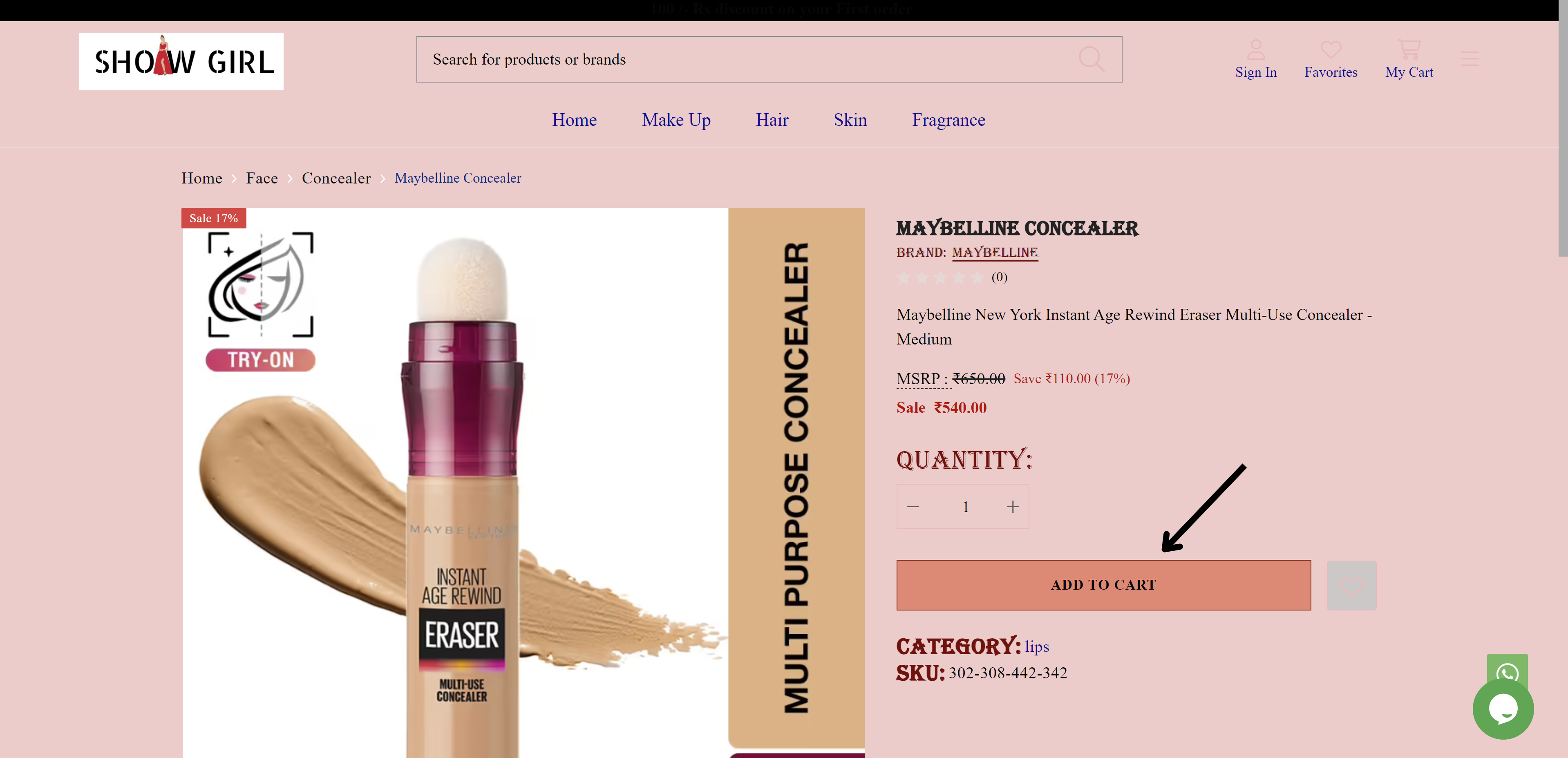
fig: Border color
STEP 29:
Click on Background Color to specify the background color of a button.
STEP 30:
Choose the background color from the color palette or enter the color code manually.
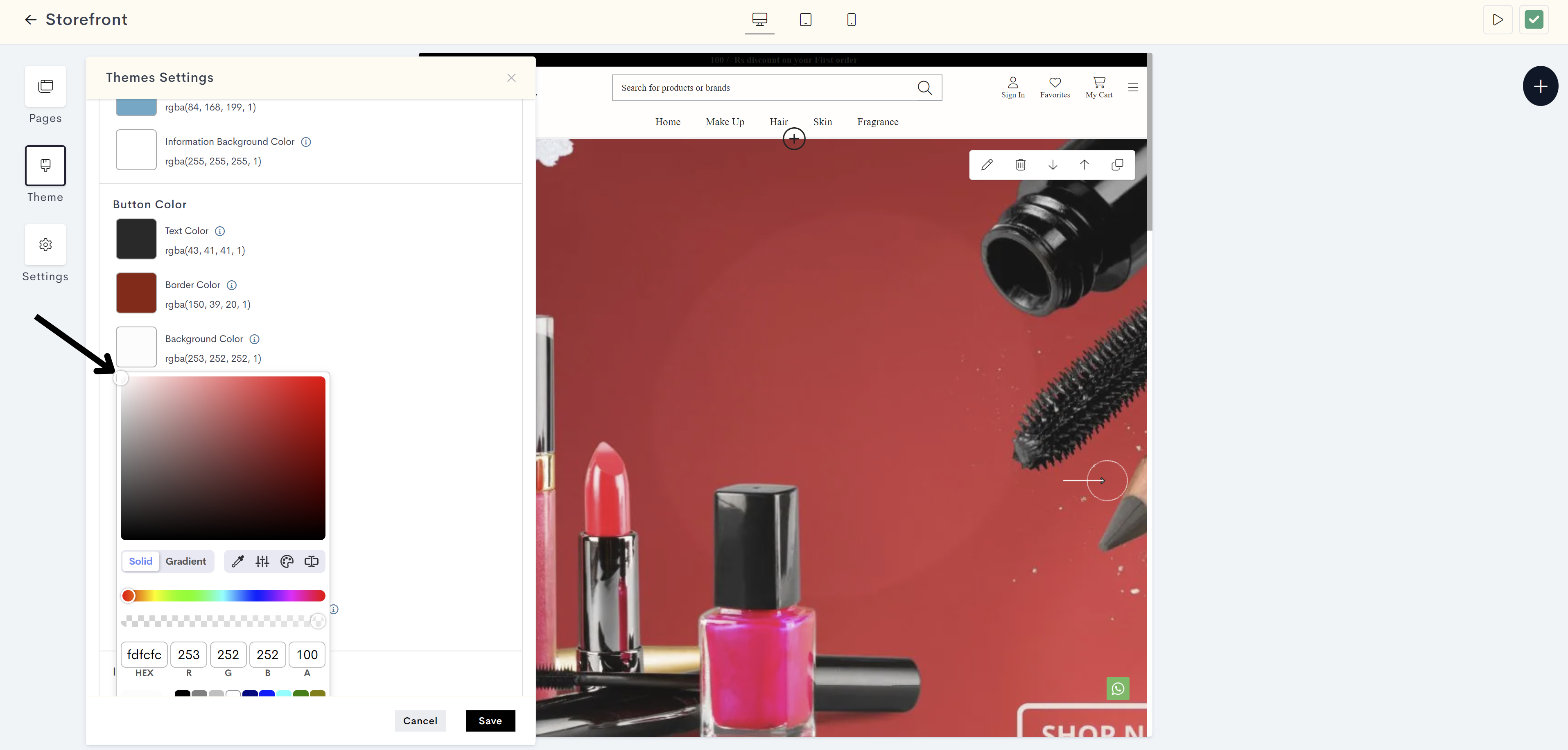
The changes will be reflected on background of button on your website. Please refer to fig: Button background color.
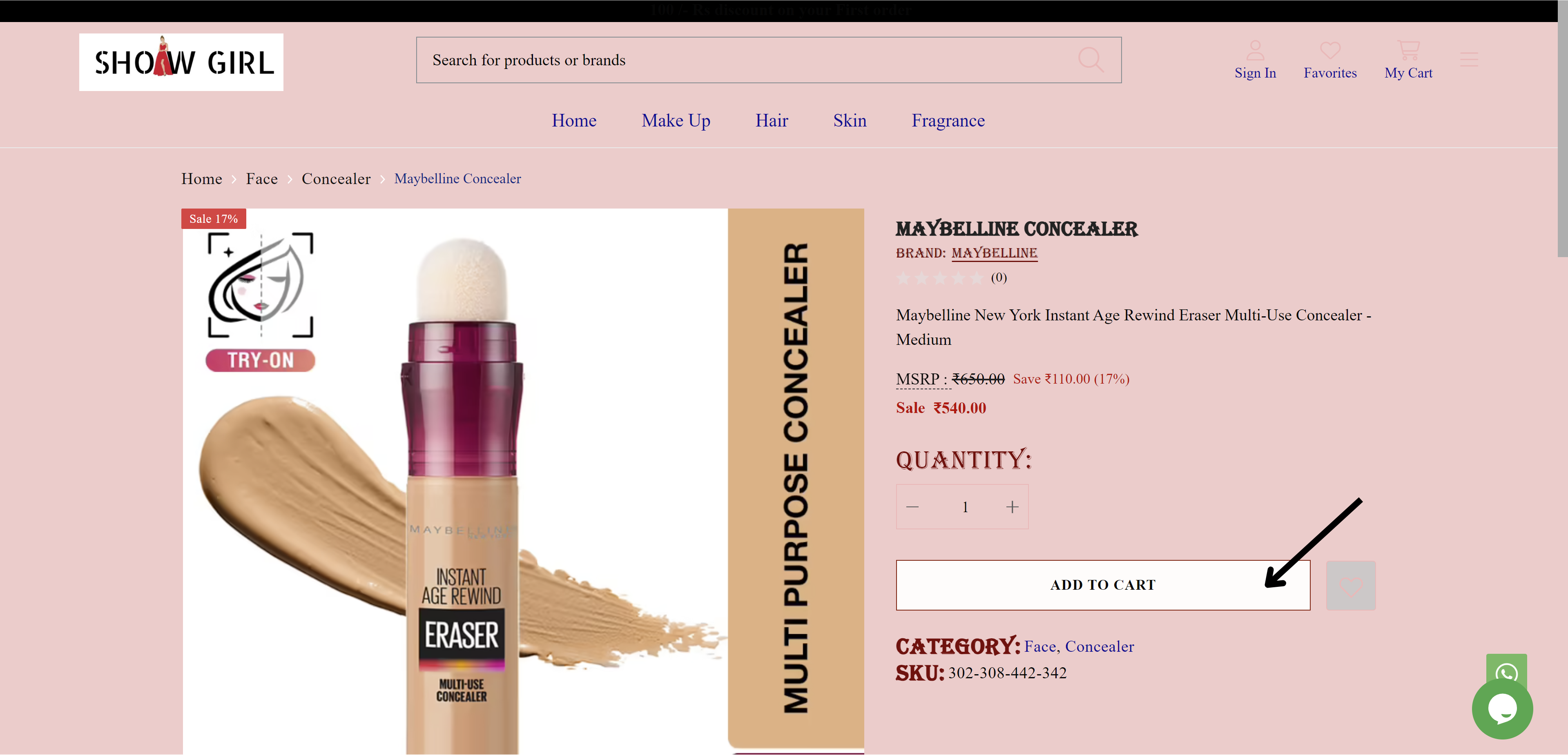
fig: Button background color
STEP 31:
Click on Hover / Active Color to indicate the color change of a button when hovered over or clicked.
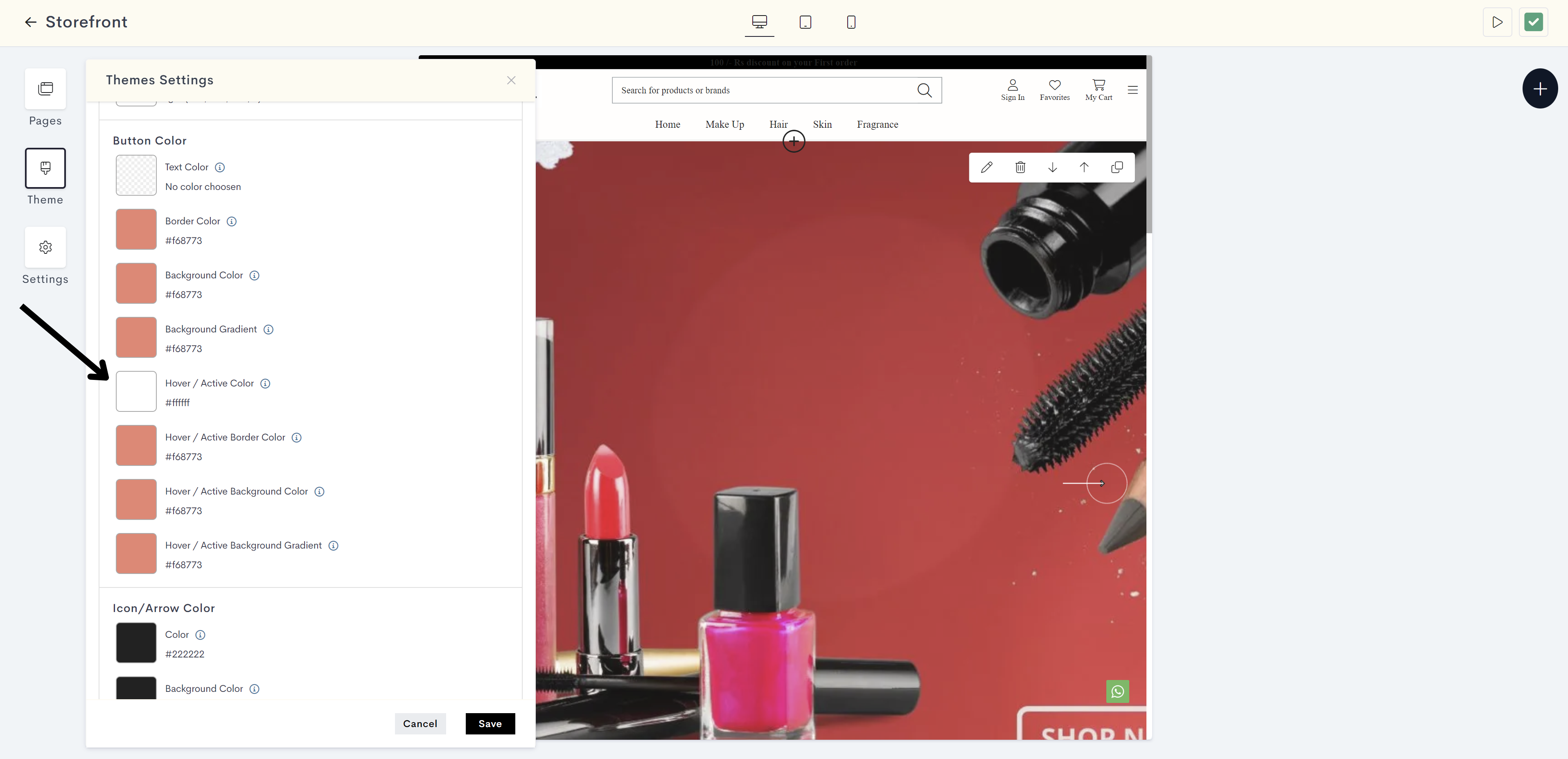
STEP 32:
Choose the hover / active color from the color palette or enter the color code manually.
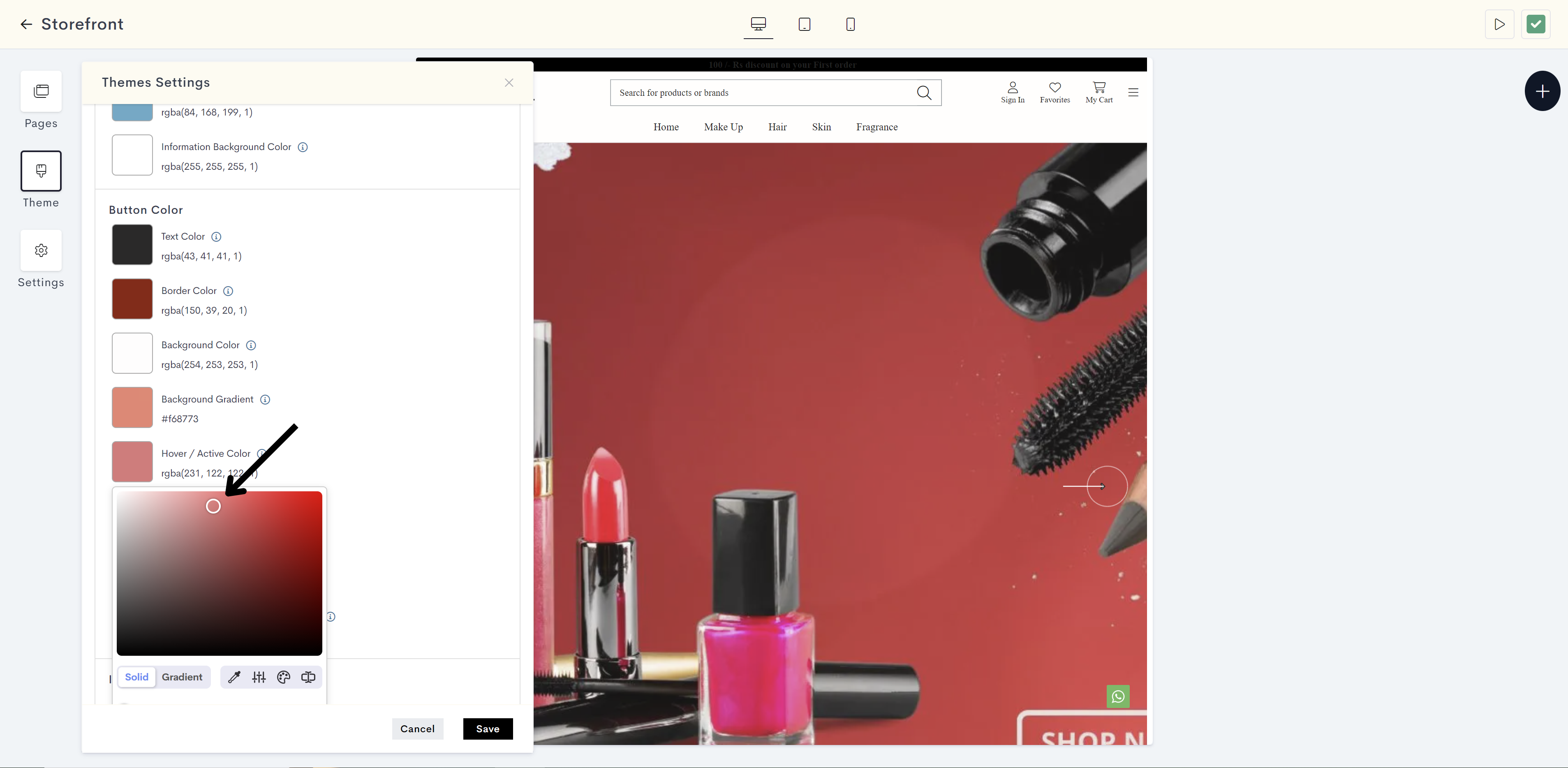
The changes will be reflected on text on button when hovering or clicking. your website. Please refer to fig: Hover/Active color.
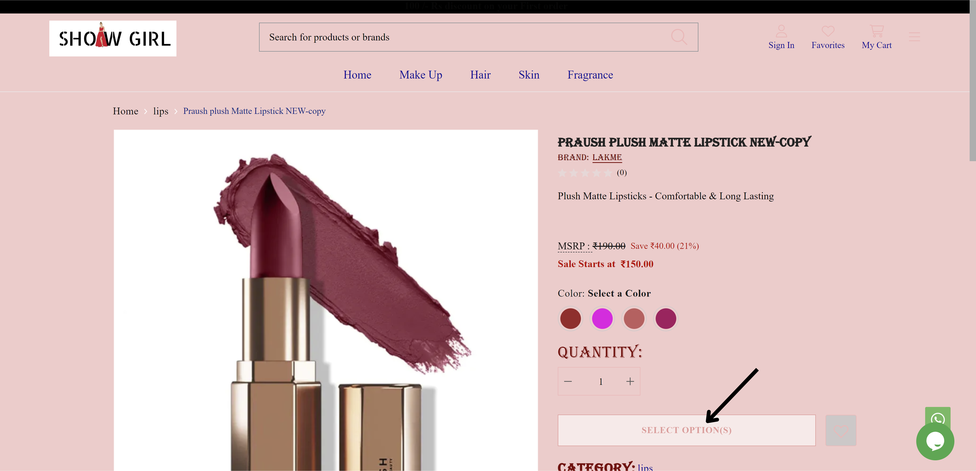
fig: Hover/Active color
STEP 33:
Click on Hover / Active Border Color to define the border color of a button when hovered over or clicked.
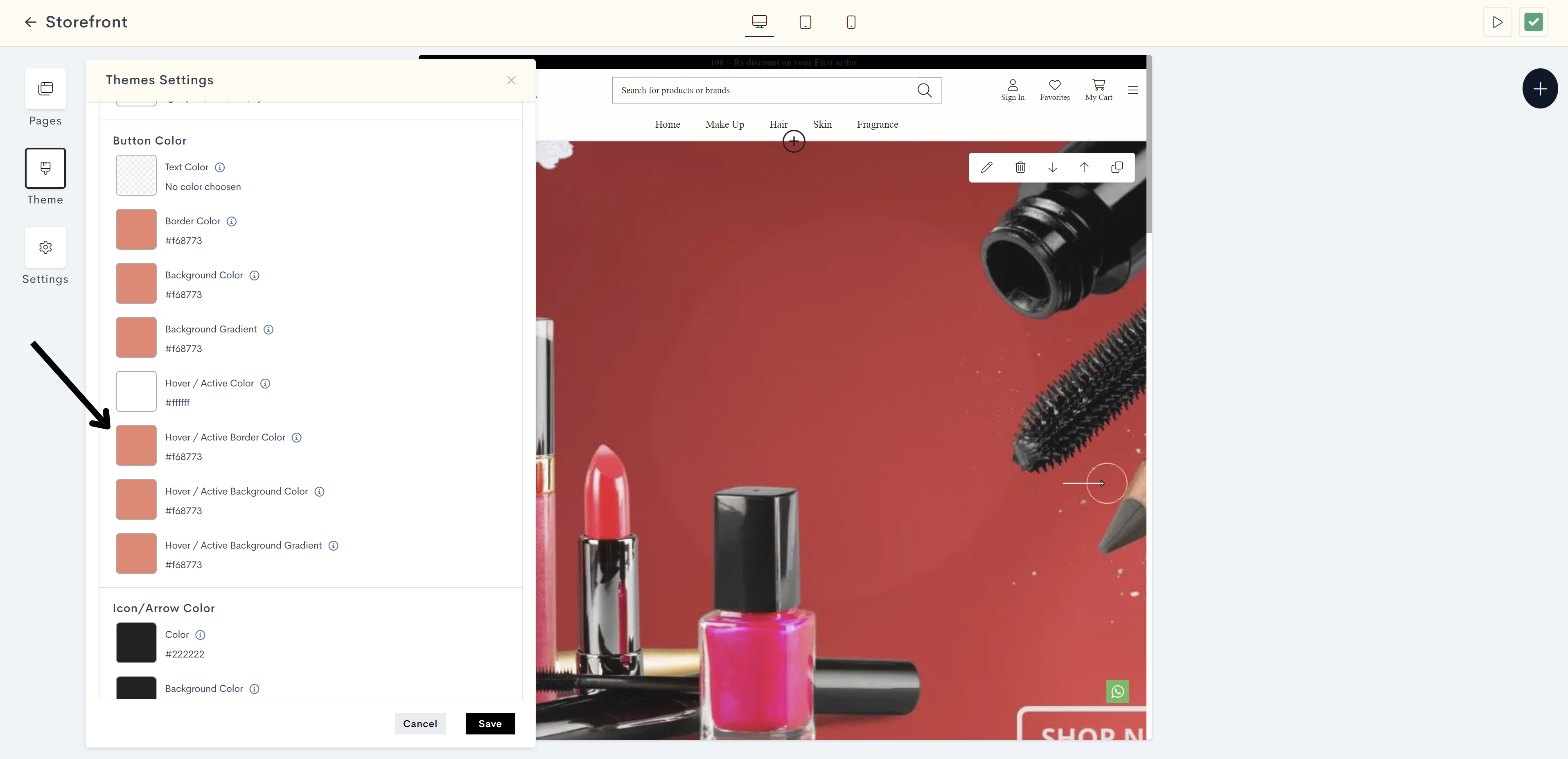
STEP 34:
Choose the hover / active border color from the color palette or enter the color code manually.
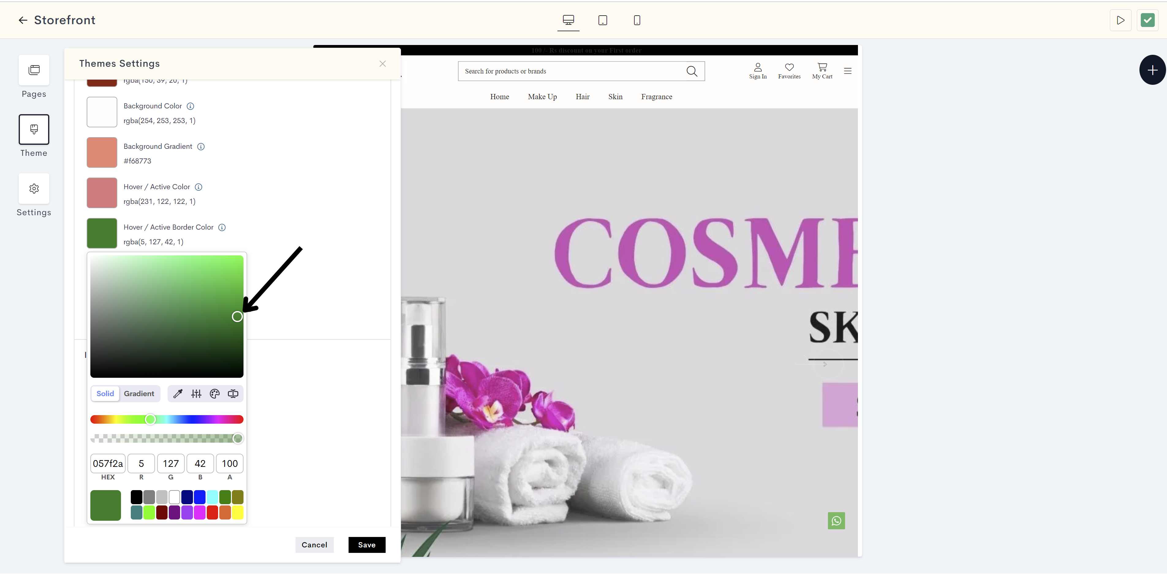
The changes will be reflected on Border of button when hovering or clicking. your website. Please refer to fig: Hover/Active border color.
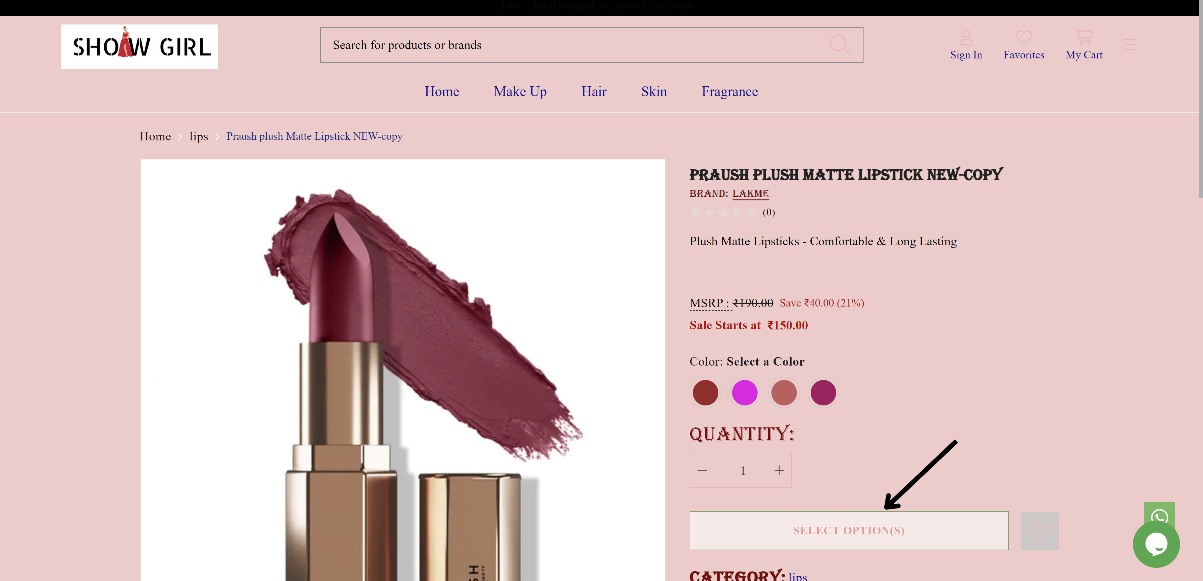
fig: Hover/Active border color
STEP 35:
Click on Hover / Active Background Color to set the background color of a button when hovered over or clicked.
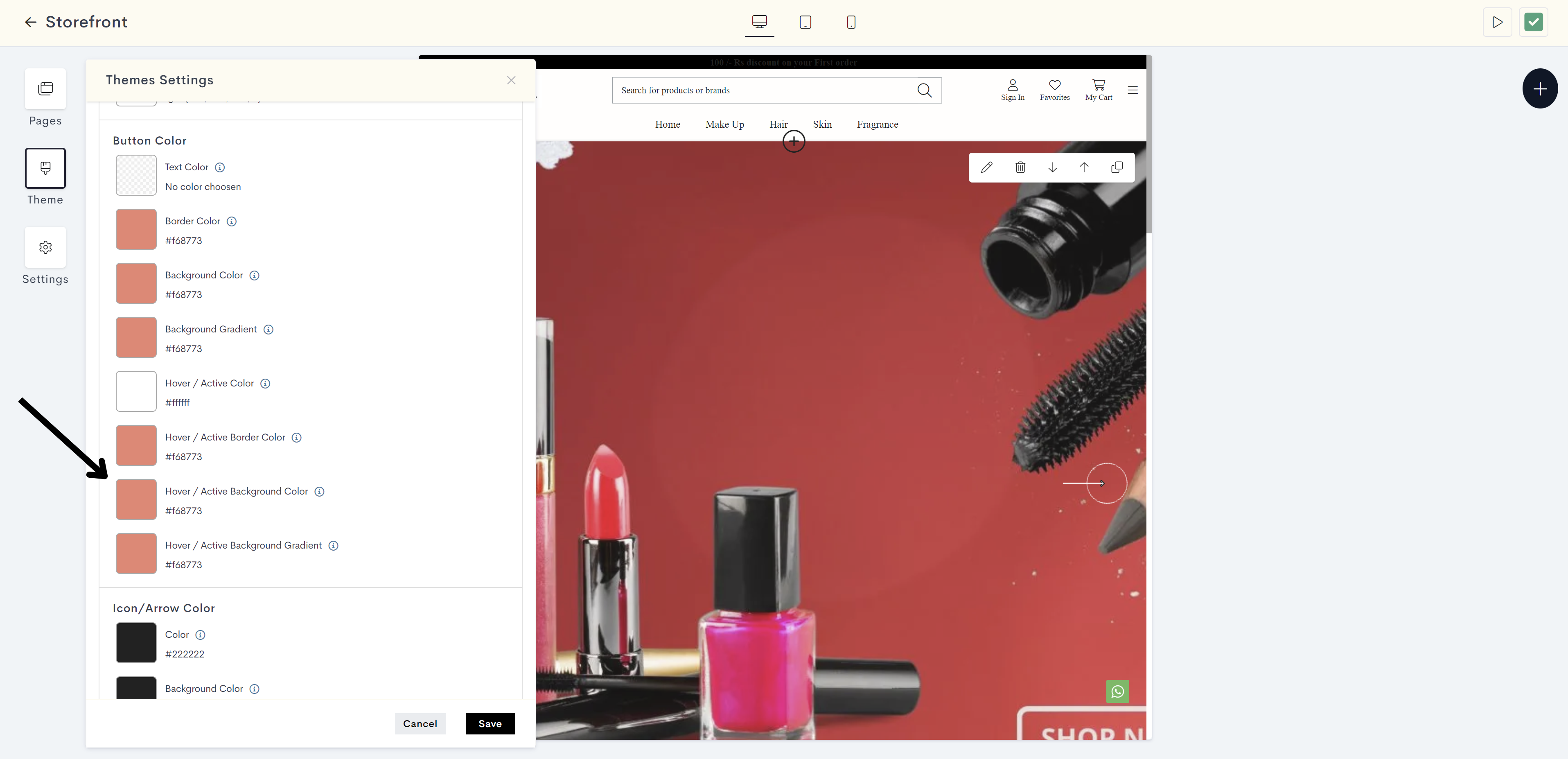
STEP 36:
Choose the hover / active background color from the color palette or enter the color code manually.
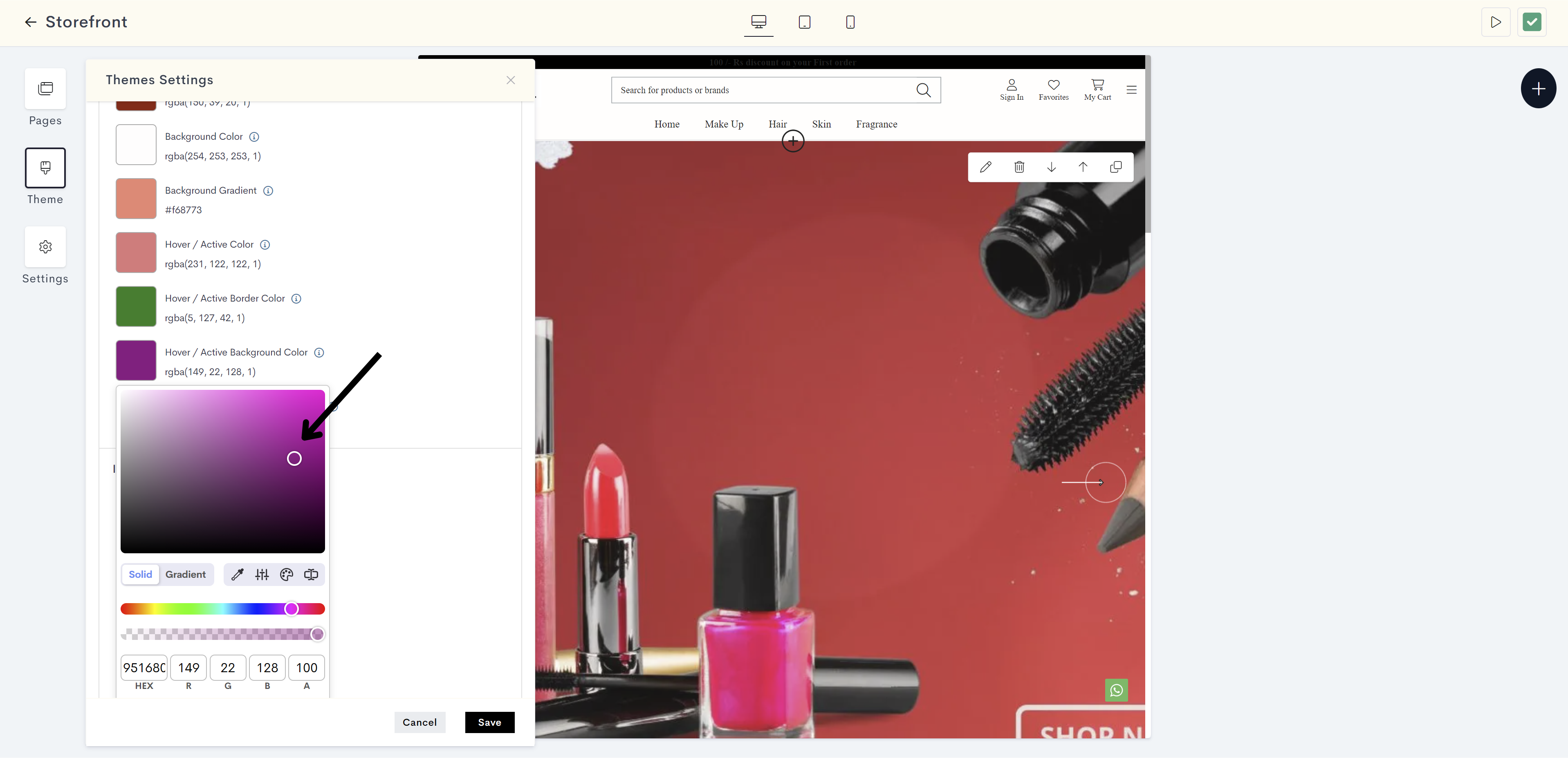
The changes will be reflected on background of button when hovering or clicking your website. Please refer to fig: Hover/Active background color.
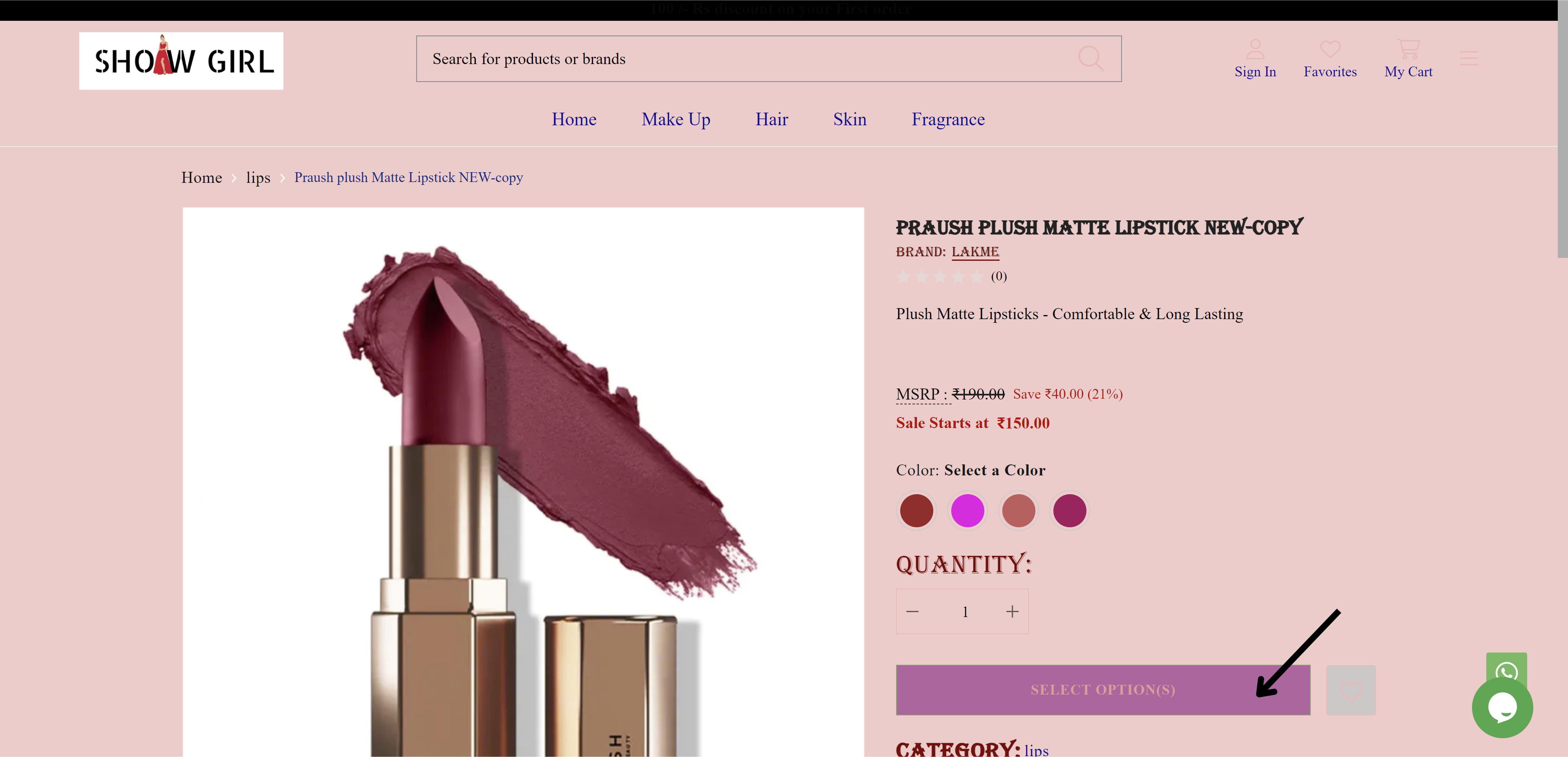
fig: Hover/Active background color
STEP 37:
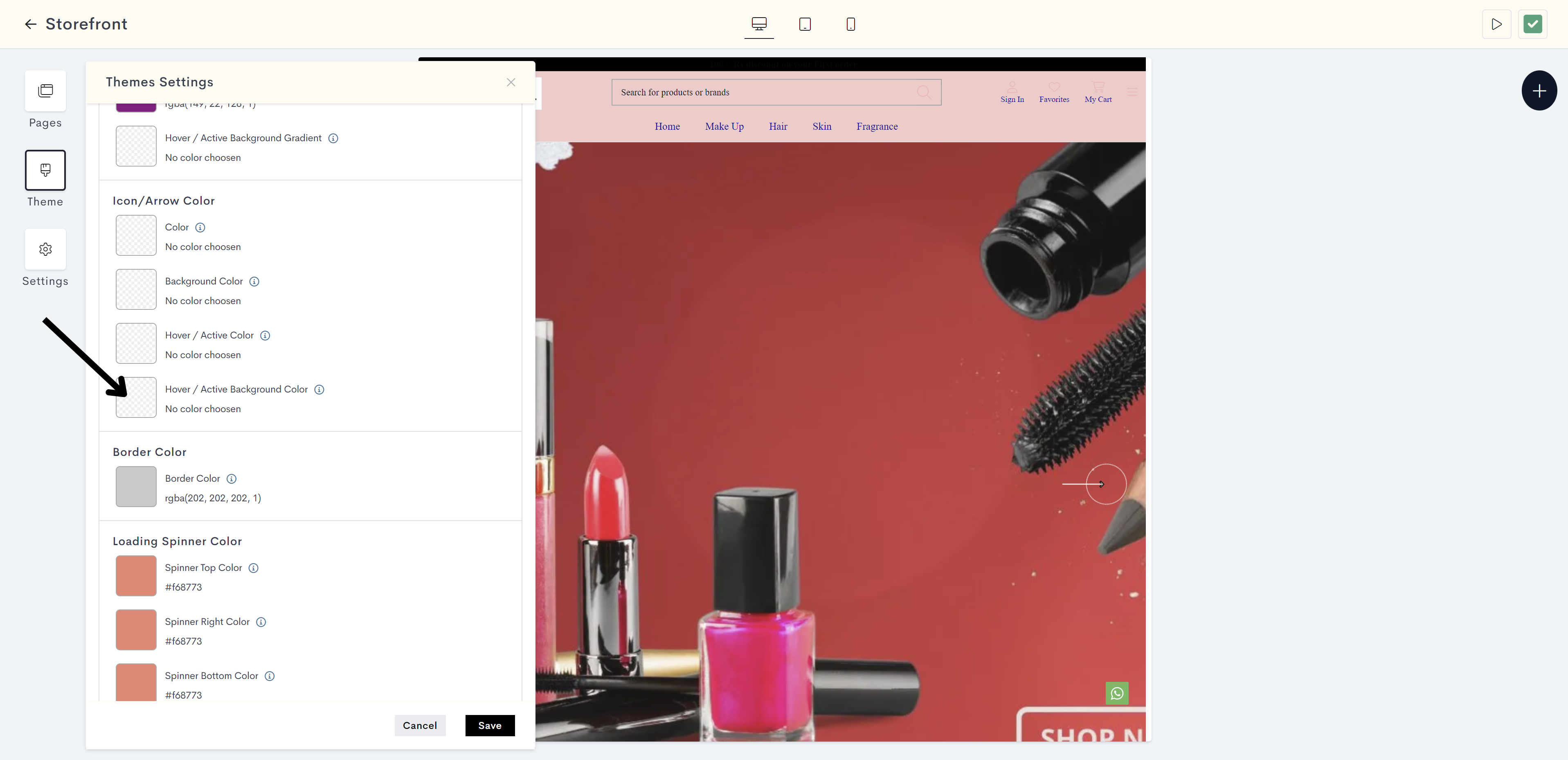
Icon/Arrow Color
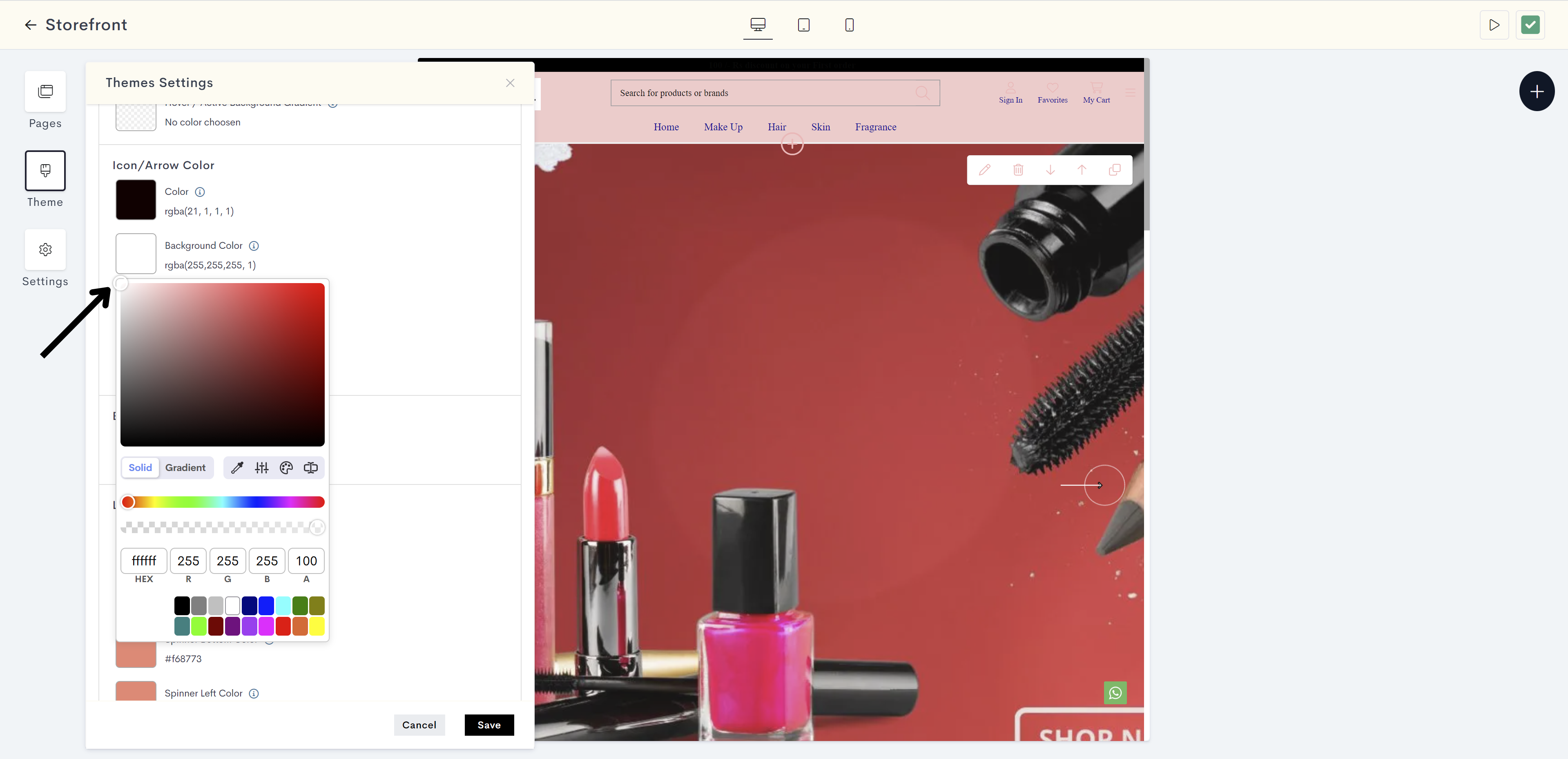
Click on Color. This is to used to specify the color of icons or arrow graphics.
Note: Icons on websites are compact, visual symbols or representations used to convey information or actions. Arrows on websites are graphical elements in the shape of pointed lines or triangles, guide user actions, or highlight clickable elements.
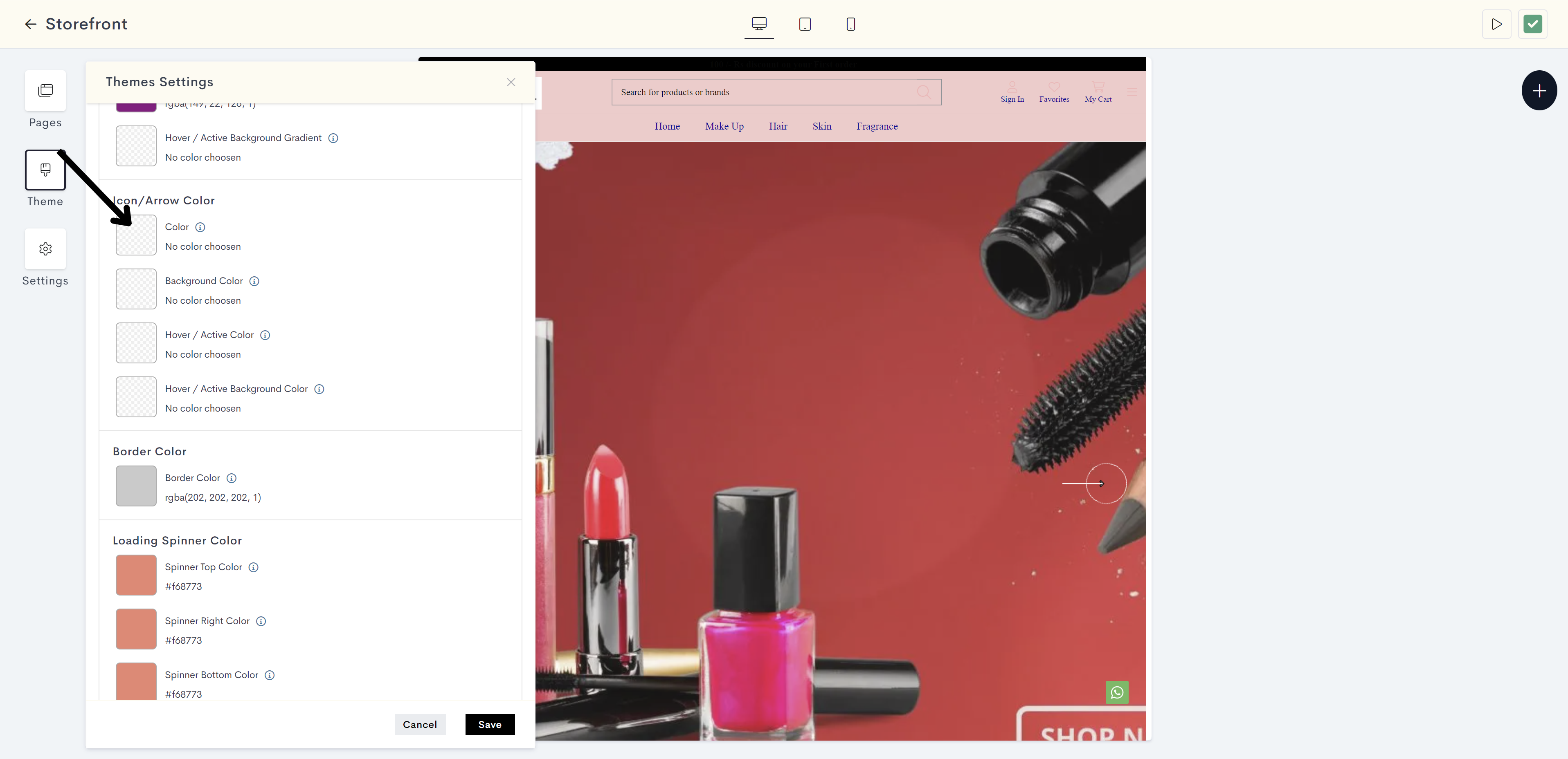
STEP 38:
Choose the color from the color palette or enter the color code manually.
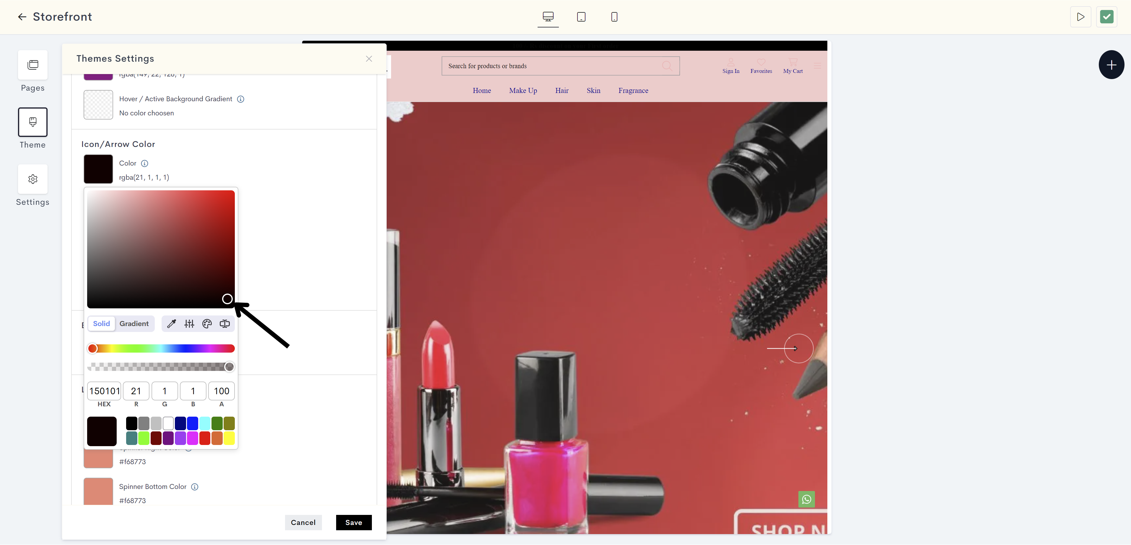
The changes will be reflected on Icons your website. Please refer to fig: Icon color.
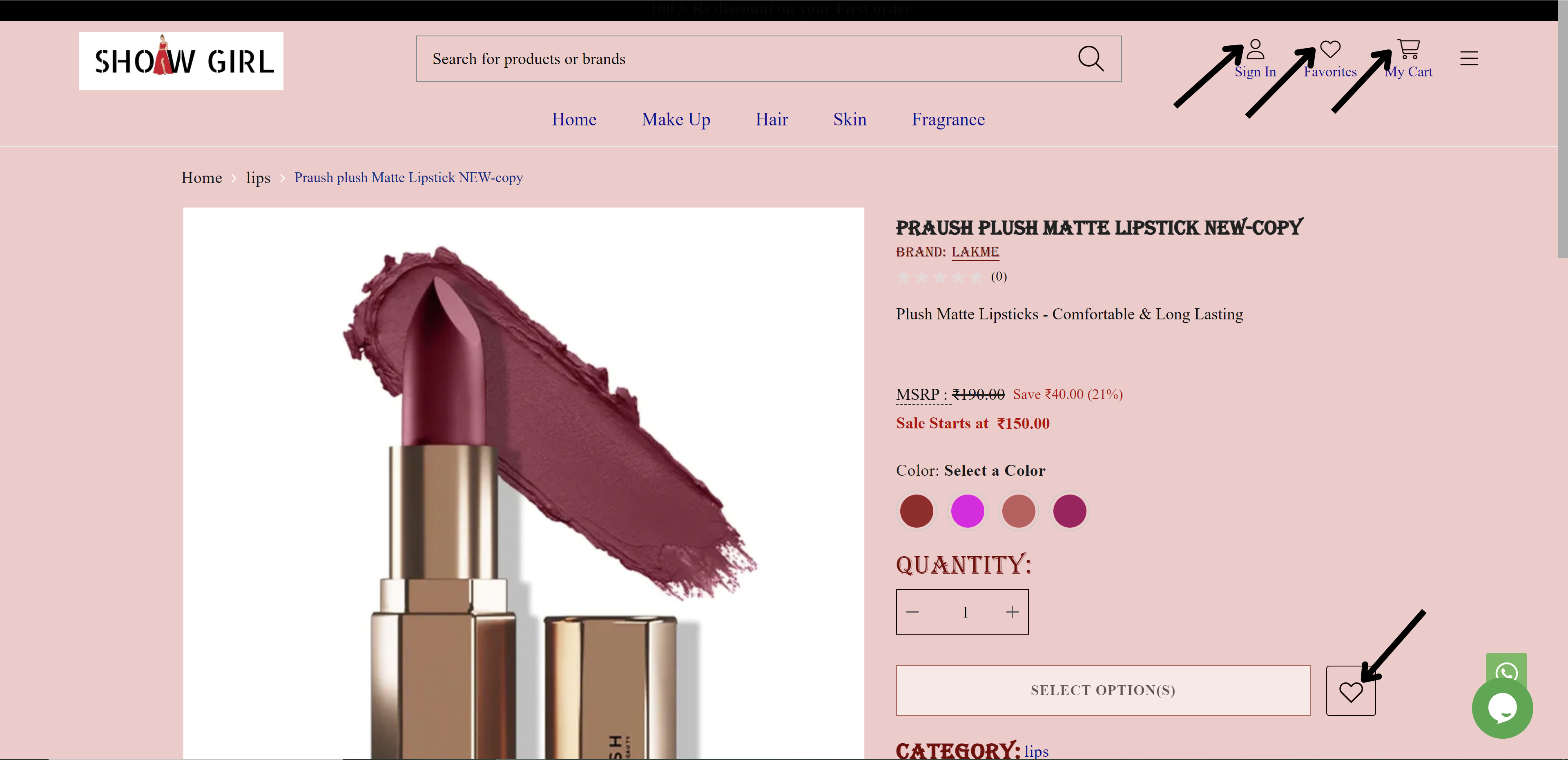
fig: Icon color
STEP 39:
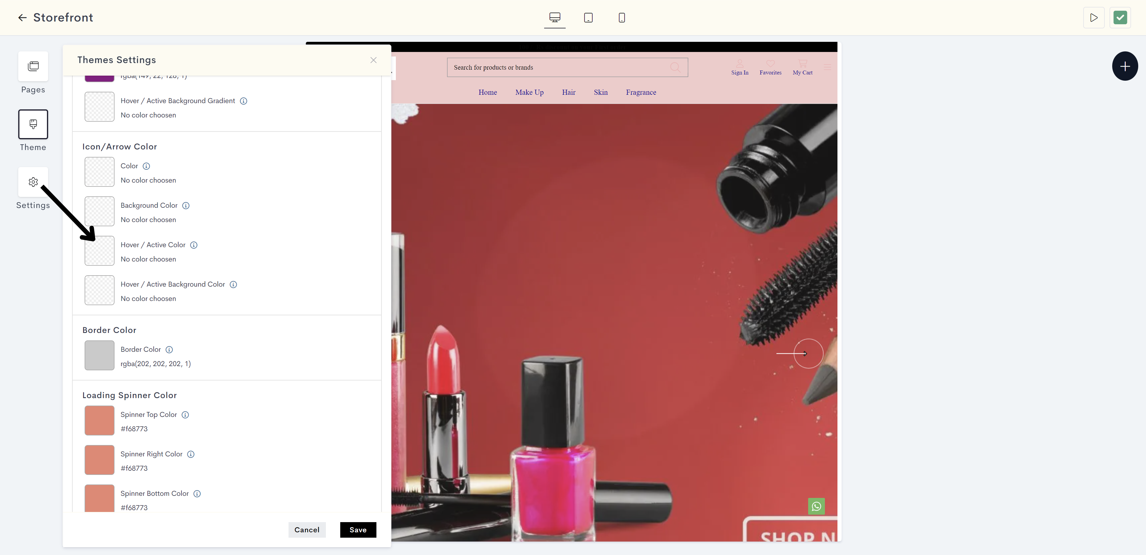
Click on Background Color. It is to used to set the background color behind icons or arrows.
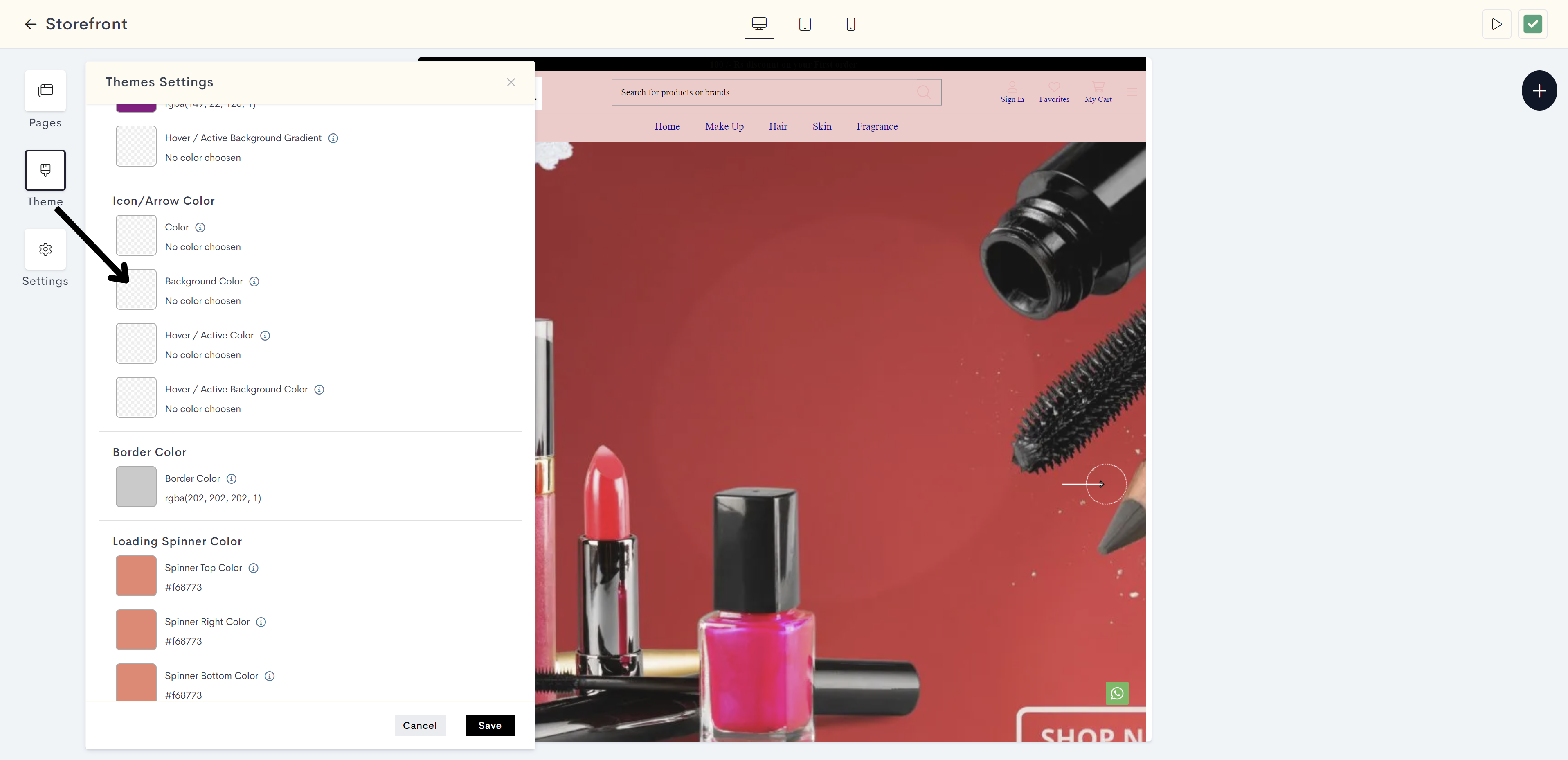
STEP 40:
Choose the background color from the color palette or enter the color code manually.
The changes will be reflected on background of Icon on website. Please refer to fig: Icon background color.
fig: Icon background color
STEP 41:
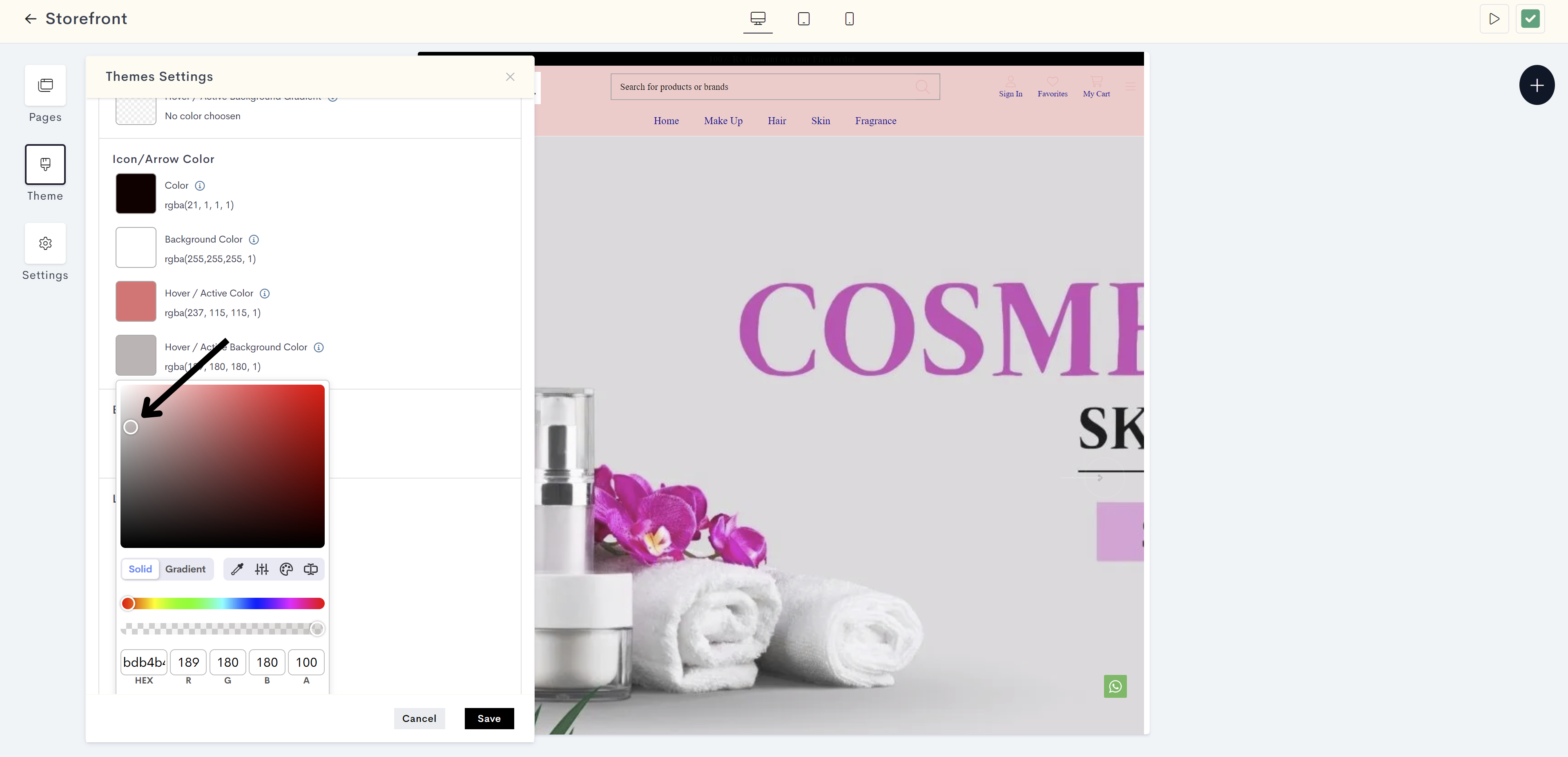
Click on Hover/Active color. It is to used for indicating the color change when icons or arrows are hovered over or clicked.
STEP 42:
Choose the hover/active color from the color palette or enter the color code manually.
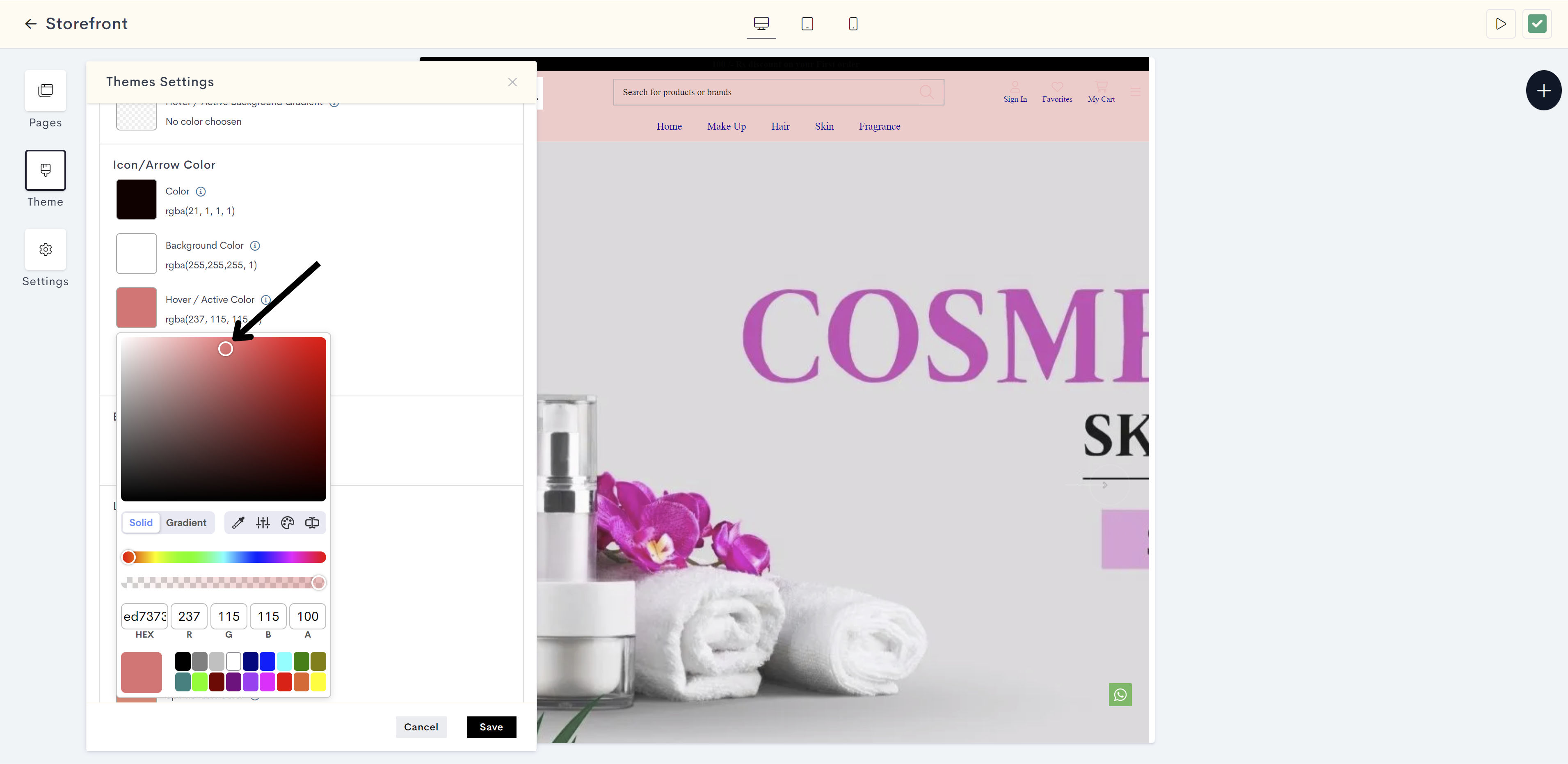
The changes will be reflected on Icon on website when hovering or clicking. Please refer to fig: Icon hover color.
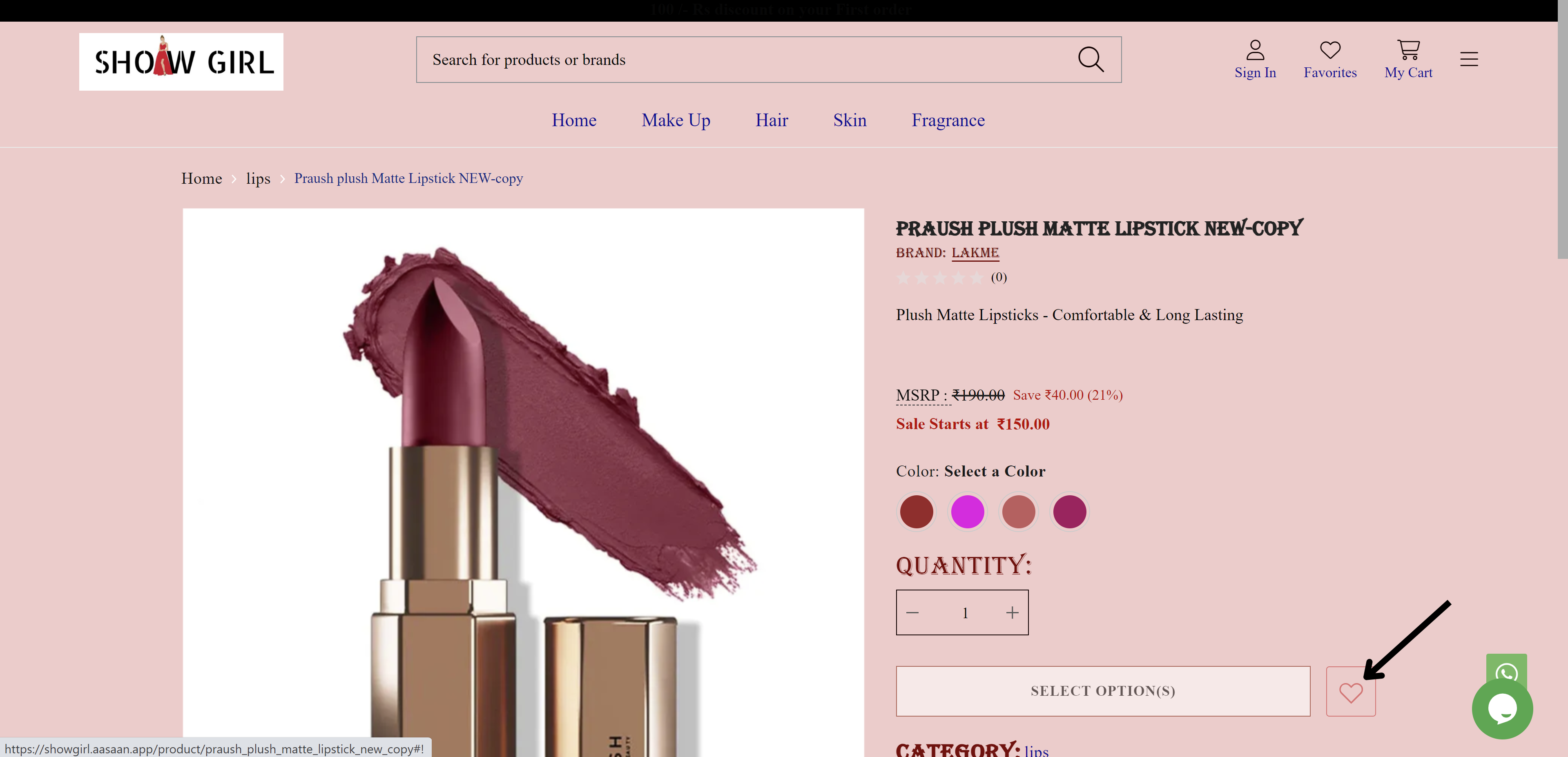
fig: Icon hover color
STEP 43:
Click on Hover/Active Background color. It is used to define the background color when icons or arrows are hovered over or clicked.
STEP 44:
Choose the hover/active background color from the color palette or enter the color code manually.
The changes will be reflected on background of Icon on website when hovering or clicking. Please refer to fig: Icon hover/active background color.
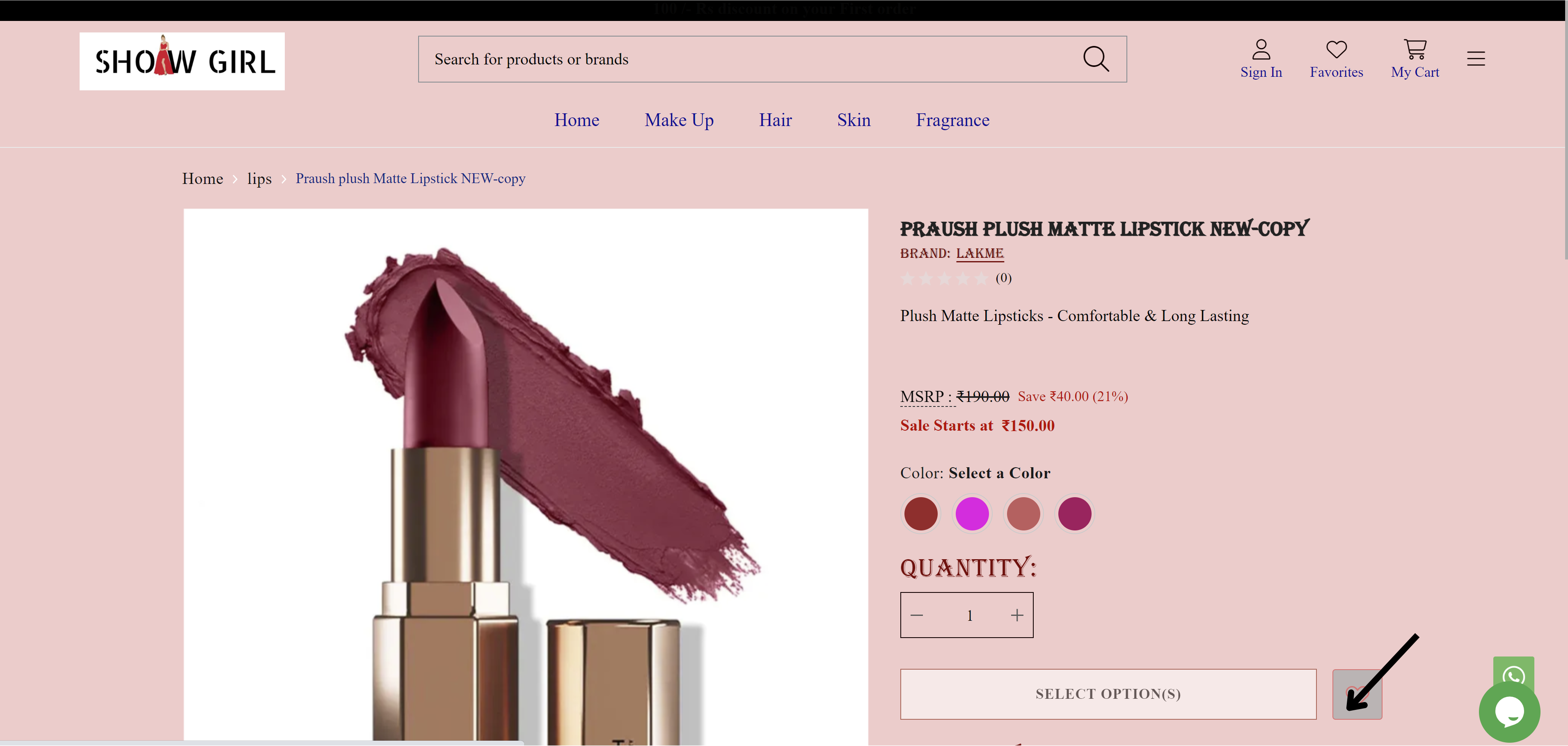
fig: Icon hover/active background color
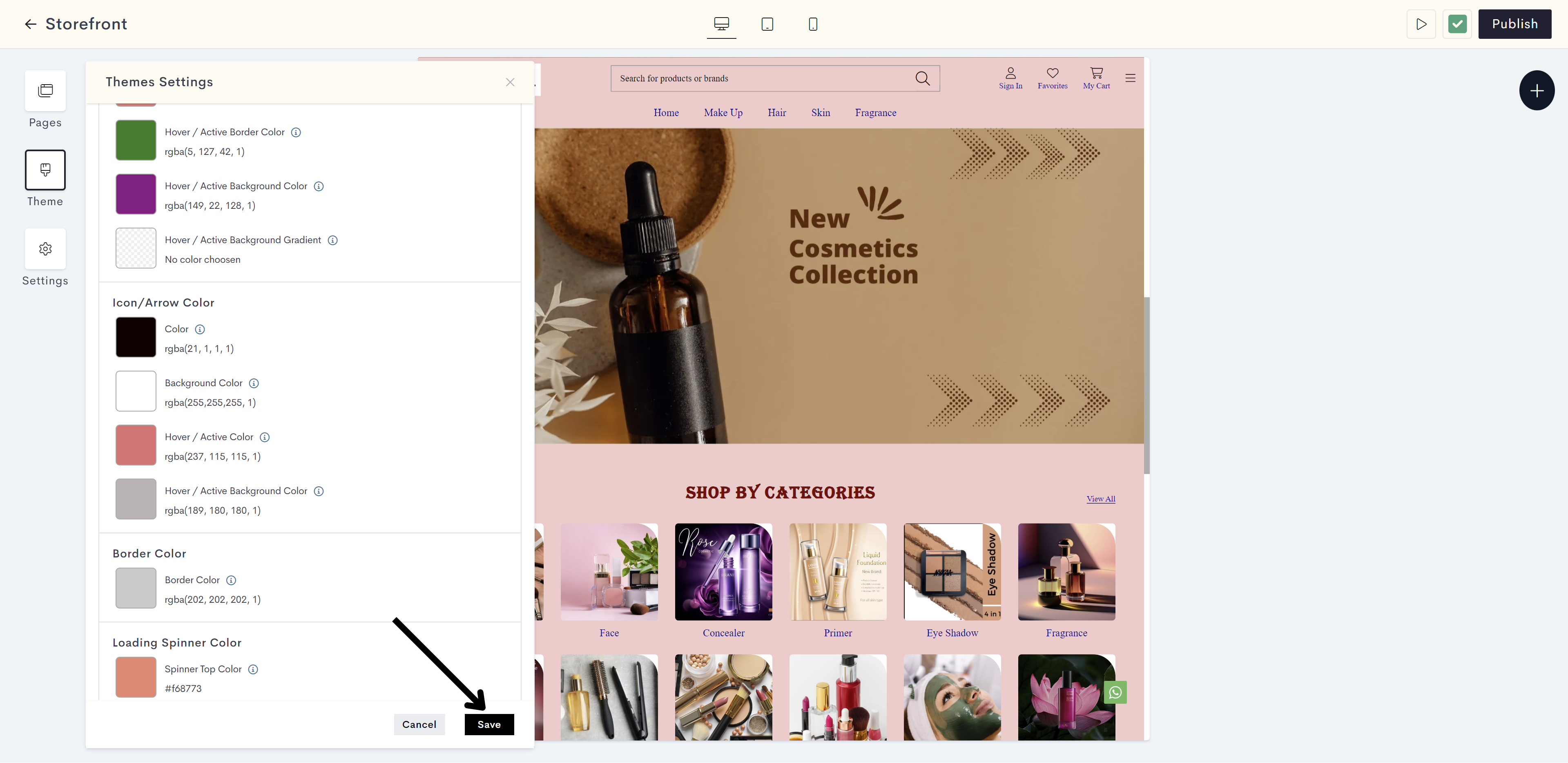
STEP 45:
Click on Save.
Your body color settings have been saved successfully.
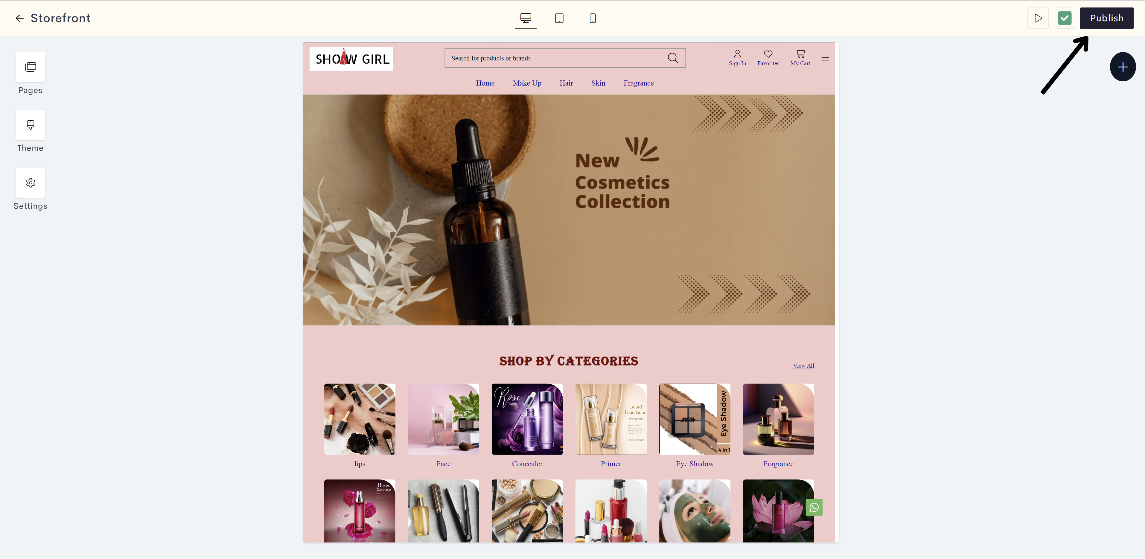
STEP 46:
Click on Publish to make your changes live on your website.
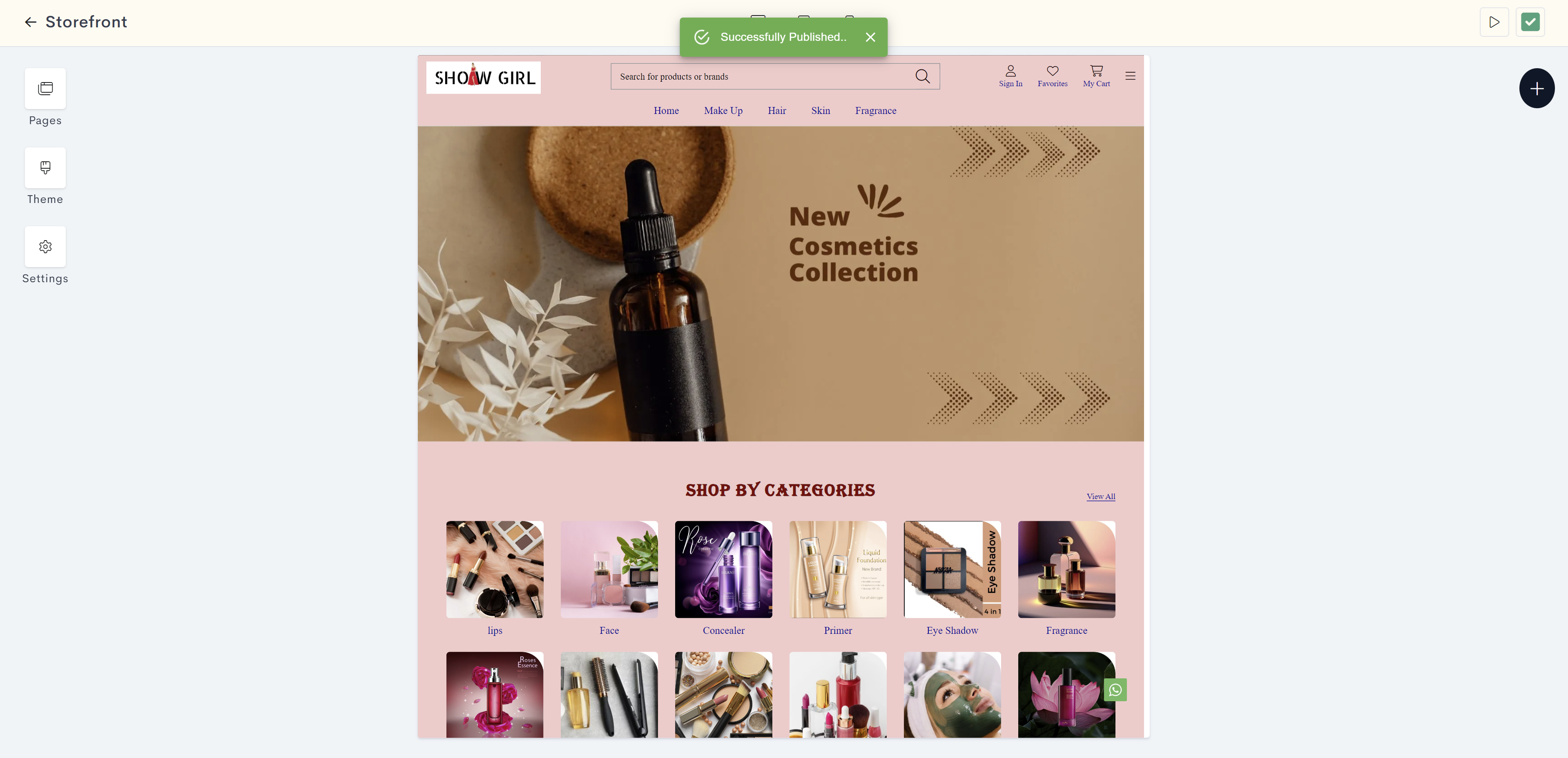
Your body color changes have been successfully published.
Last modified 1mo ago